Why Another Excel Book?
If you search Amazon or the Internet for Excel books, you’ll have plenty of Excel books to choose from. So why write yet another? There are several features that make Making Data Sexy different from most of the books on the market.
- There’s a version for both PC and Mac users. Mac users are almost always overlooked with Excel guides. If you have both PC and Mac users in your organization, you can save money with a bundle.
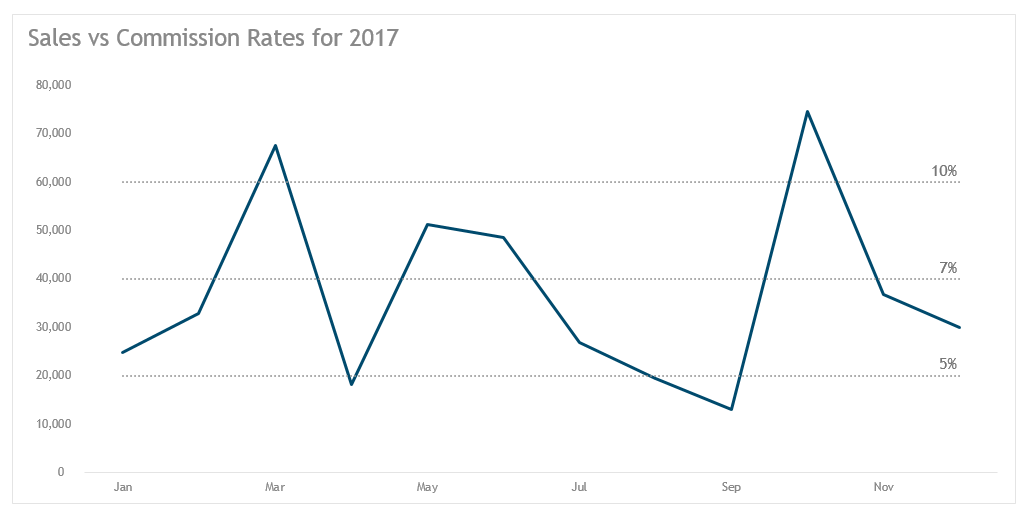
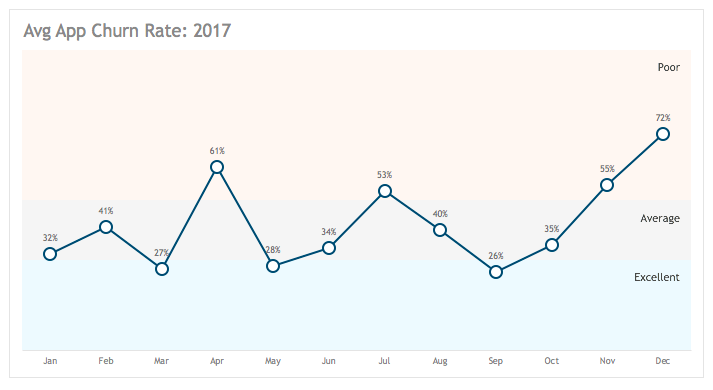
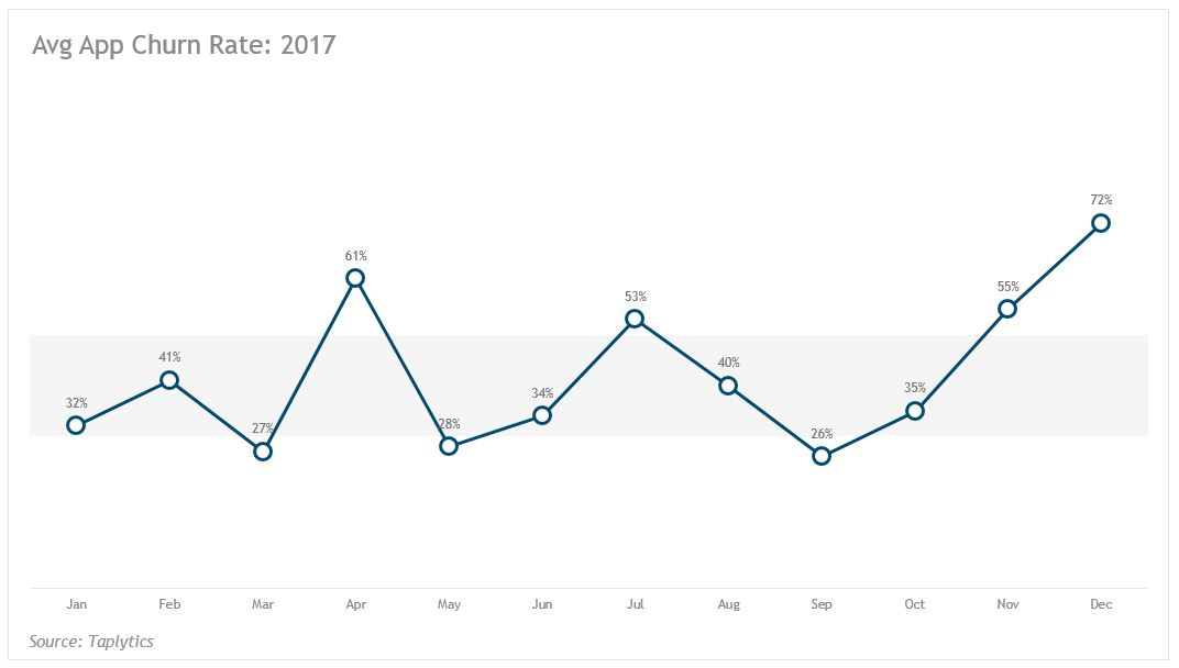
- The focus is on creating elegant, branded visualizations. I teach you to rid your charts of distracting (and ugly!) pixels, such as gridlines, busy axes, etc. And every visualization in the book is created from a three-color palette to demonstrate that even the simplest of brands can create visualizations that align with their branding.
- Tutorials are in plain English. I strive to explain the why behind the how in every tutorial, sometimes even including a Hundred-Foot View section before more complex tutorials that will give you a breakdown of the overall strategy to minimize anxiety.
- The tone is light. I am insufferably visual and rely heavily on analogies and imagery. I also have a writing style that can be…How do I describe it?…On the lighter side. You will find references to everything from The Breakfast Club to Rudolph to Stranger Things.
- I teach you to automate. It makes no sense to do the same repetitive tasks over and over. It leads to errors, departures from branding, and wasted effort. You’ll learn how to create themes, global templates, and chart templates.
- I let you know the minimum number of categories and metrics you need for each chart. There’s no sense getting excited about a chart just to find out that it requires three metrics when your dataset has two.
- I provide tips from my experiments. Many of the charts I teach you to create are hacks, so before I even get to the tutorial for each chart type, I share some tips, such as design pitfalls to watch out for and features that will cause Excel to crash.
- I provide you with the data I used for each of the charts. If you’d like to follow along with the data I used to create each of the 60+ visualizations, you can download the data.
- I give you the option to purchase the full workbooks and/or chart templates. If you want to deconstruct the final visualizations included in the book or start with chart templates, you can purchase these visualization accoutrements.
Sexy Data? What Does That Even Mean?
What I’m really talking about is making data both elegant and actionable—maximizing both form and function. You want your visualizations to be compelling—downright galvanizing at times. It’s very difficult to do that when your data is trapped in tables, the de facto standard for many analysts, marketers, and managers. As a budding data artist, tables will rarely do the job as well as a beautifully formatted (and carefully structured) visualization.
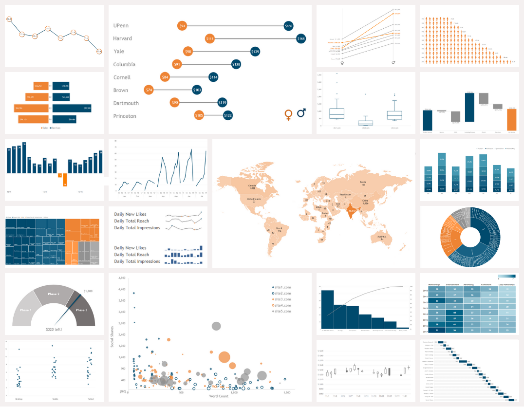
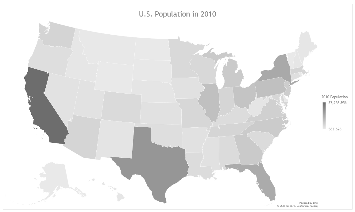
Cat Walk
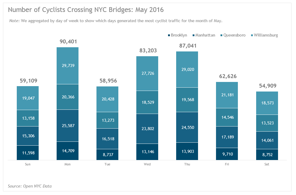
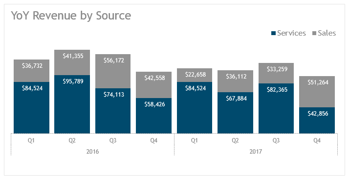
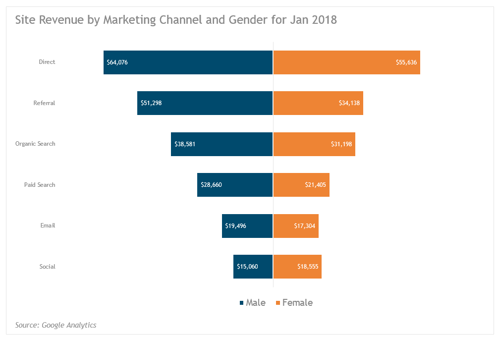
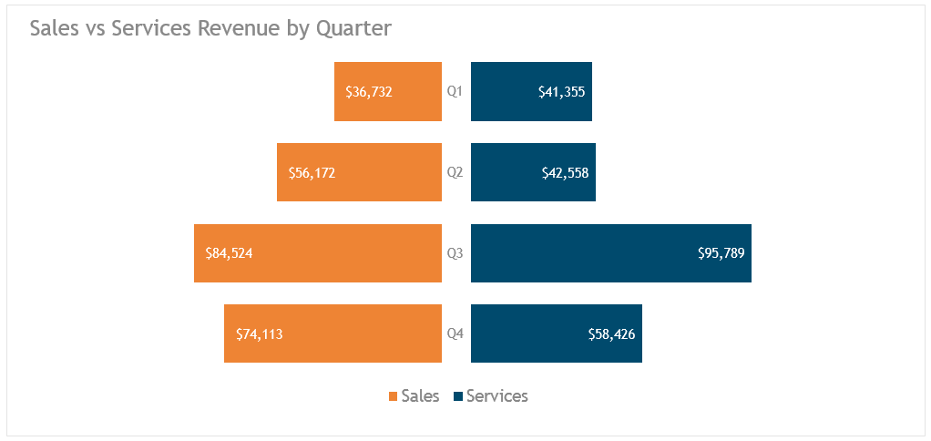
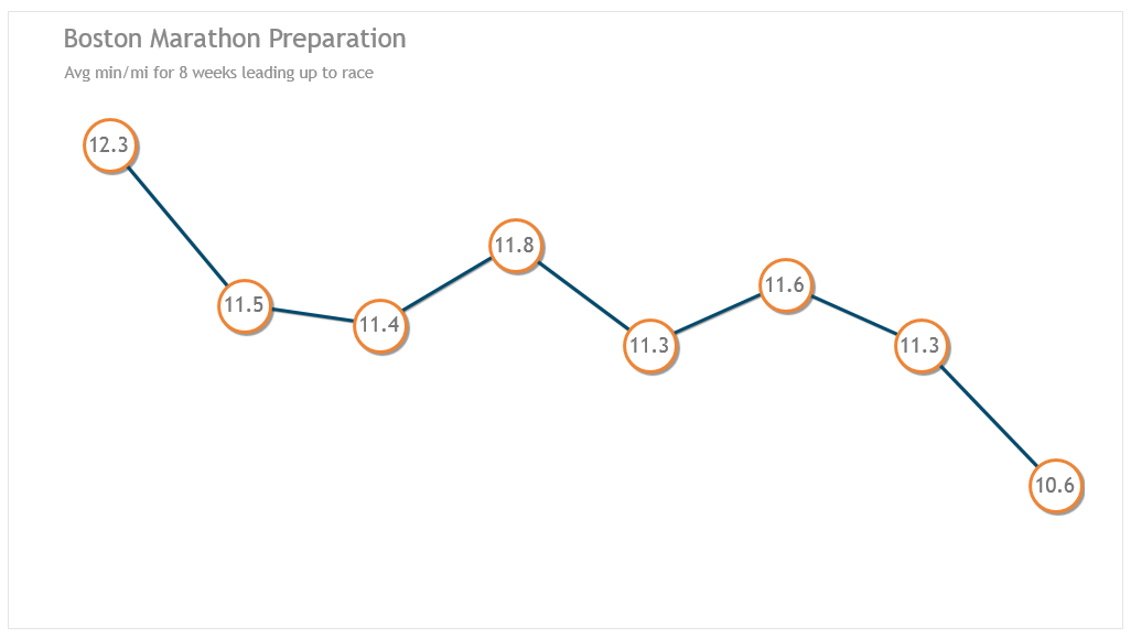
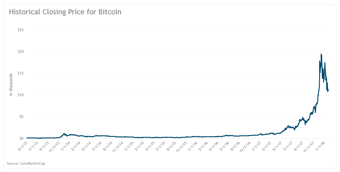
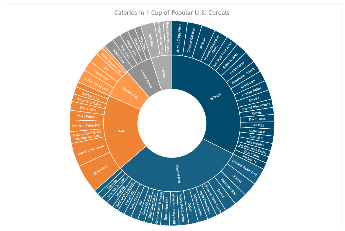
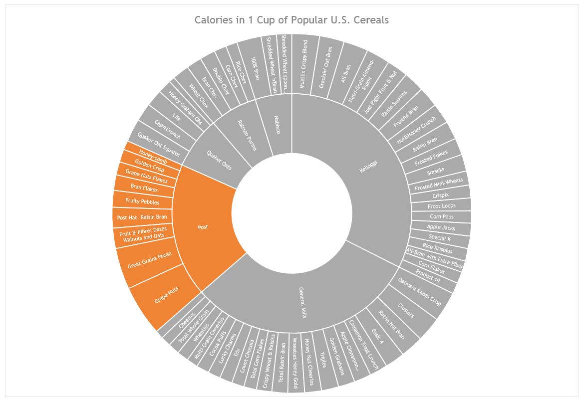
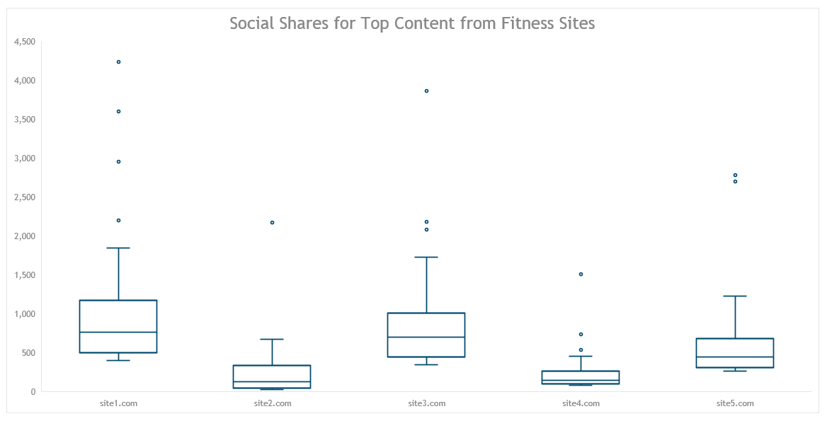
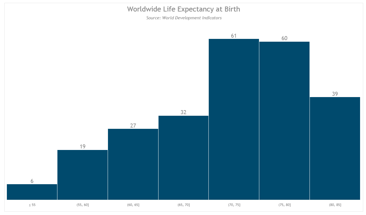
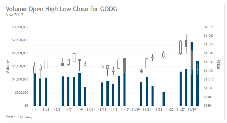
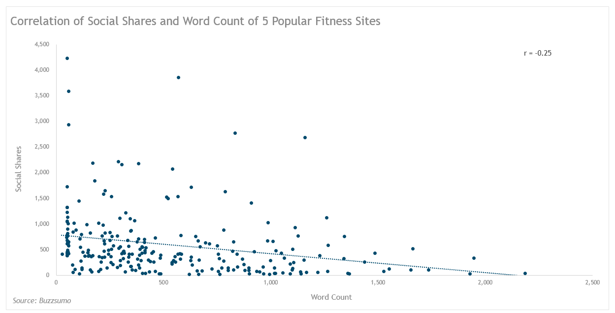
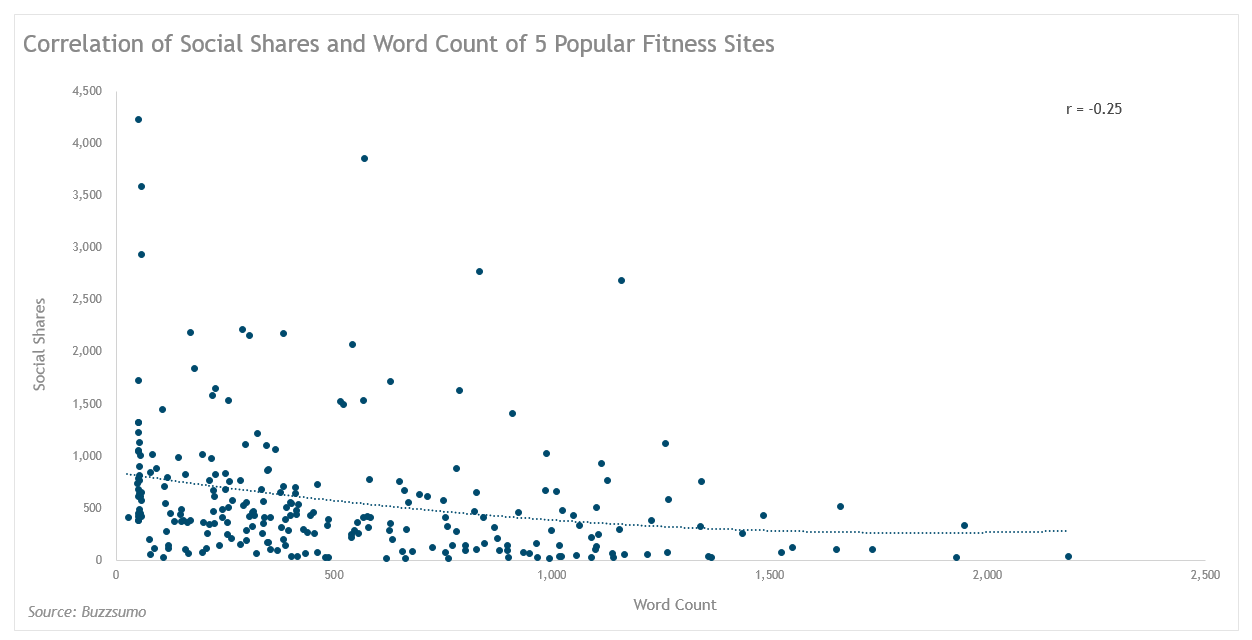
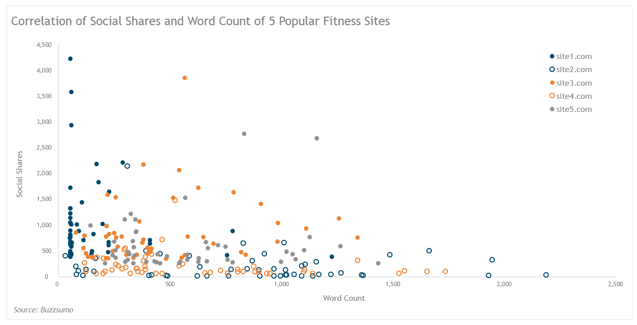
In Making Data Sexy, you will learn to create the visualizations pictured below.
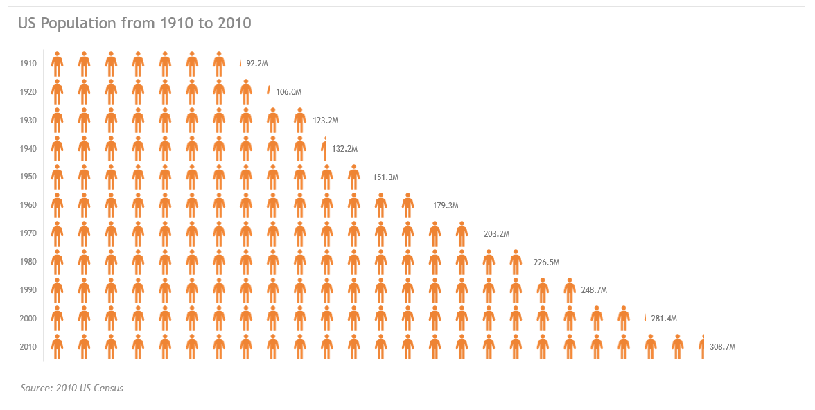
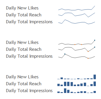
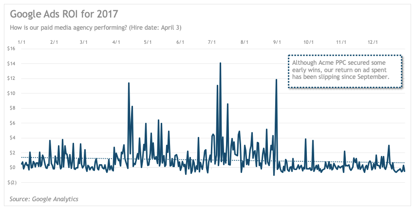
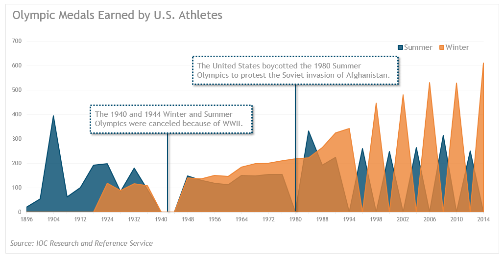
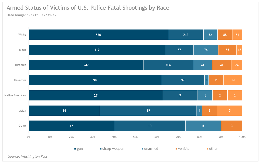
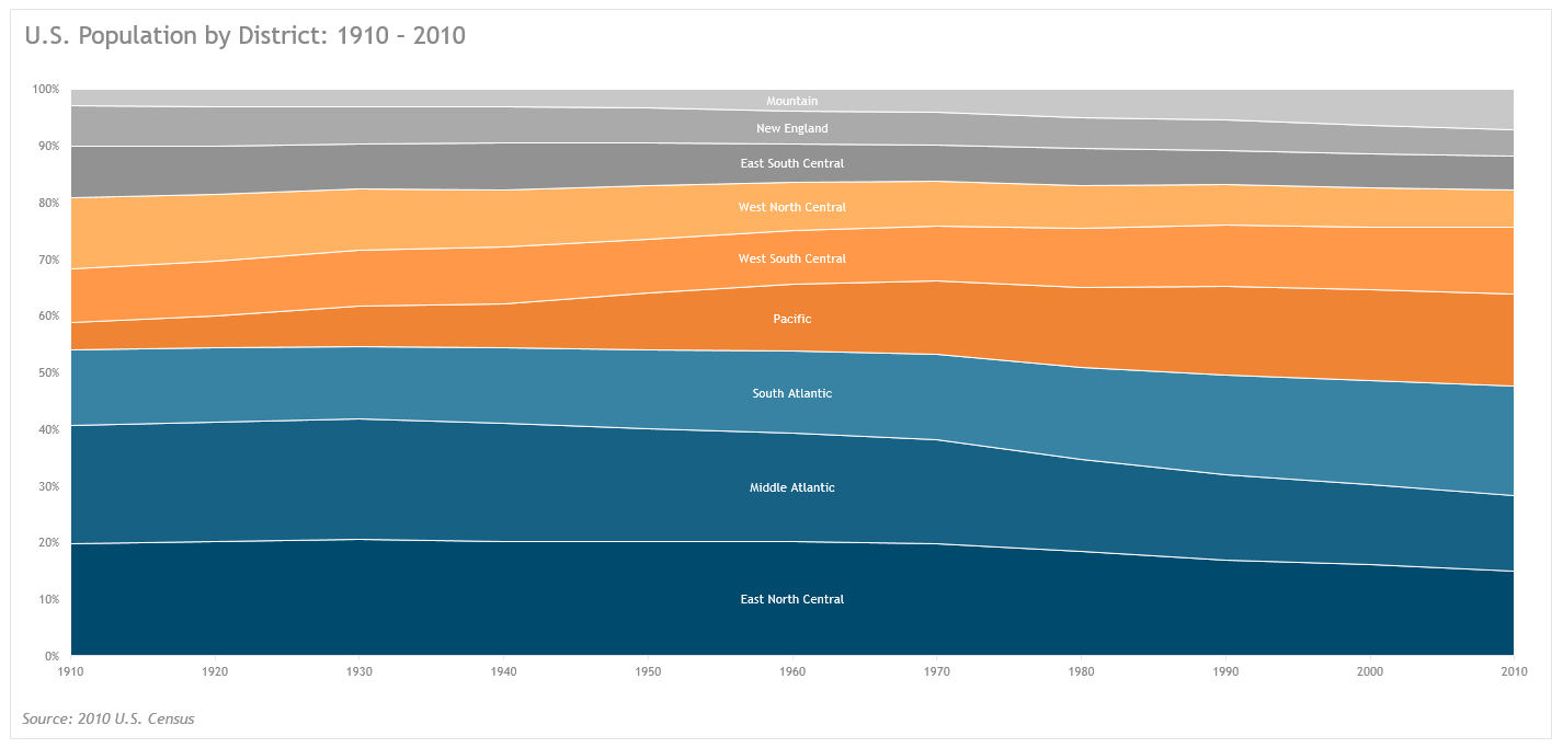
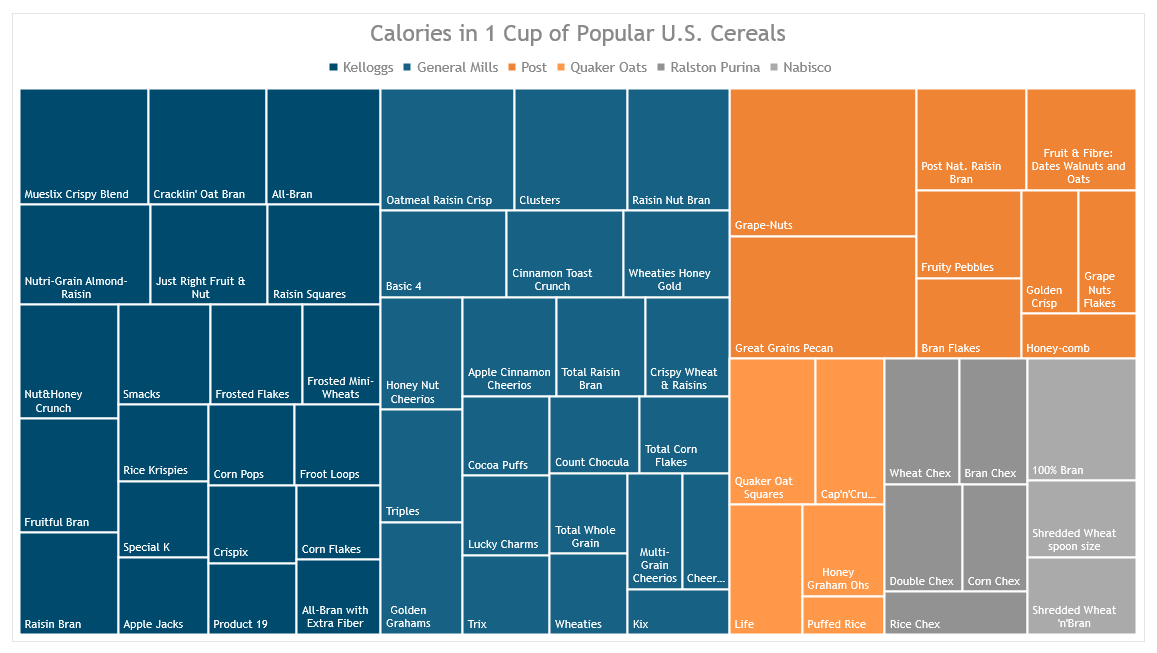
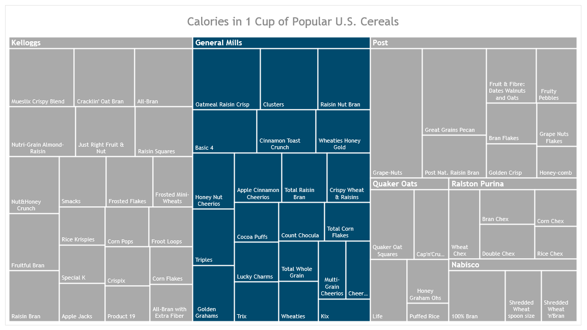
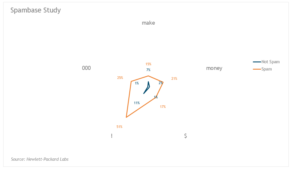
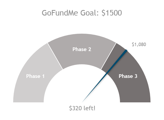
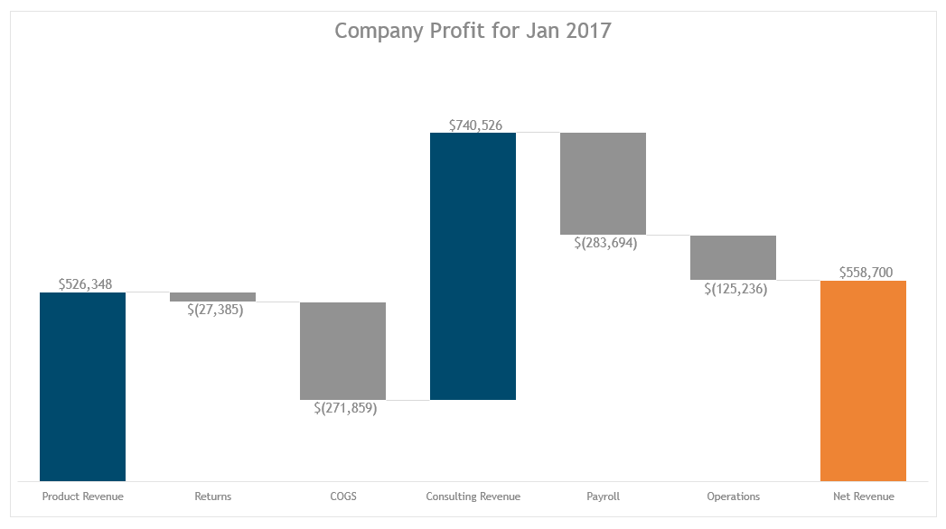
27 of the 68 visualizations covered in the book are hacks. You will learn to manipulate features like error bars, connected scatter plots, fills and outlines, unnatural combination charts (like combining a donut and pie chart to build the complex gauge chart), etc.
Set It And Forget It? Really?
Yes, that’s correct. You will learn the importance of starting with a theme. You’ll learn how to use your branded colors and fonts** to create this theme that you’ll build all your visualizations from.
I also show you how to customize Excel’s formatted tables and pivot tables to align with your branding. AND how to overcome Microsoft’s most unfortunate choice to apply a default table or pivot table style to the workbook you’re working in. (So dumb.) With these tips, tricks, and straight-up hacks, you’ll be able to build a global template that you can distribute throughout your organization to ensure all visualizations align with your style and branding guides.
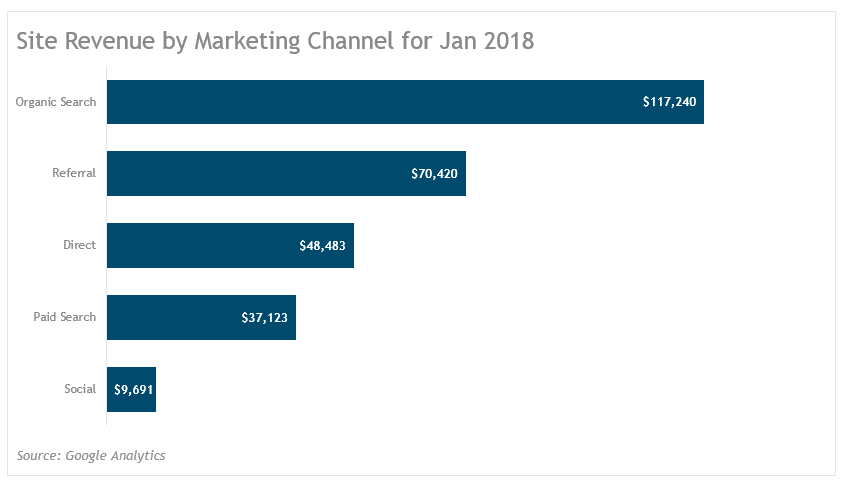
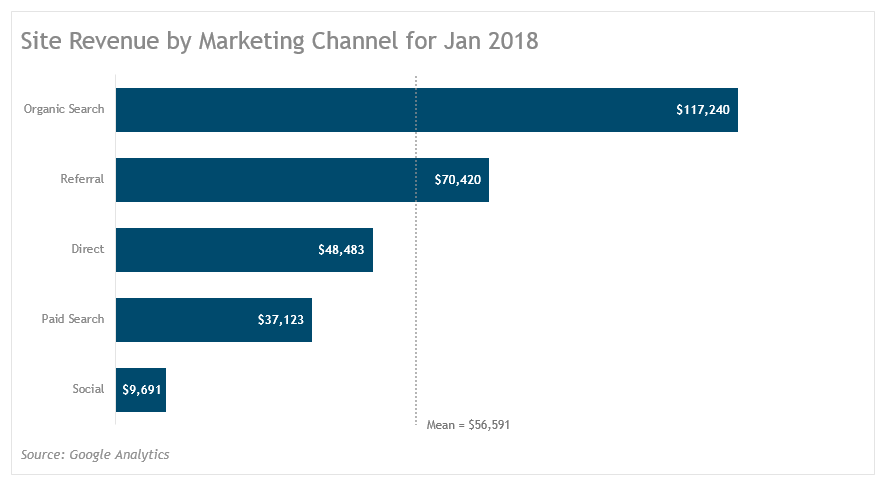
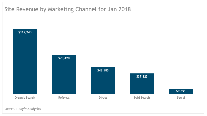
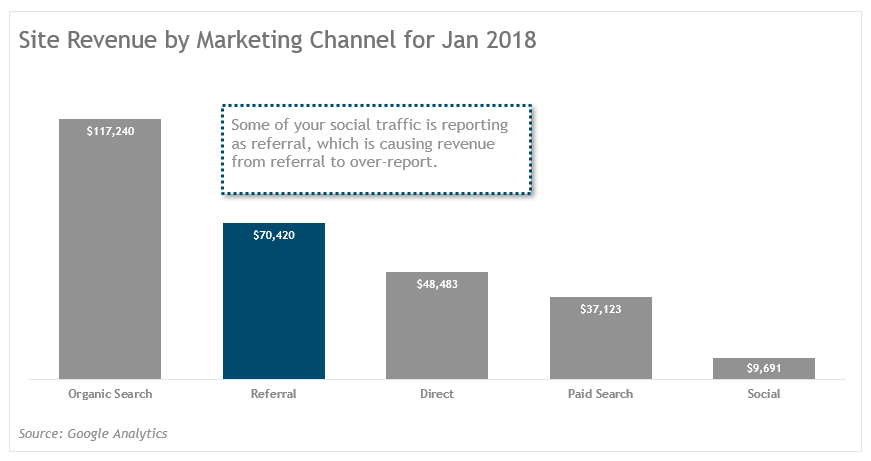
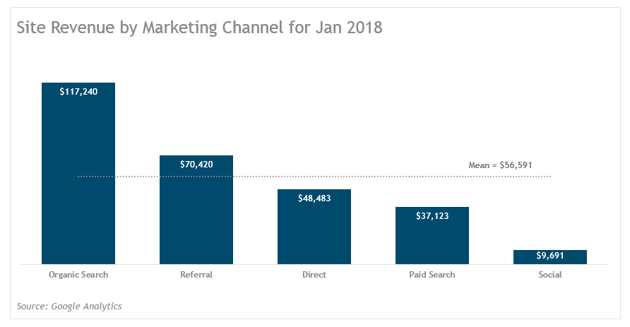
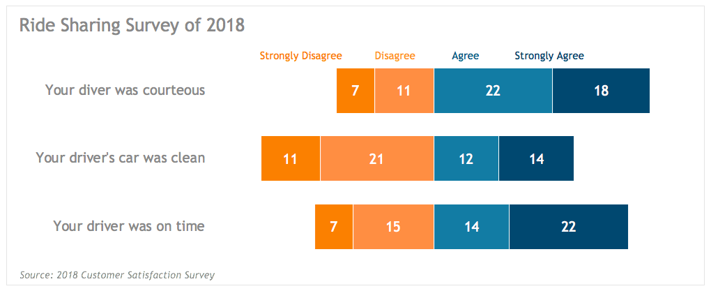
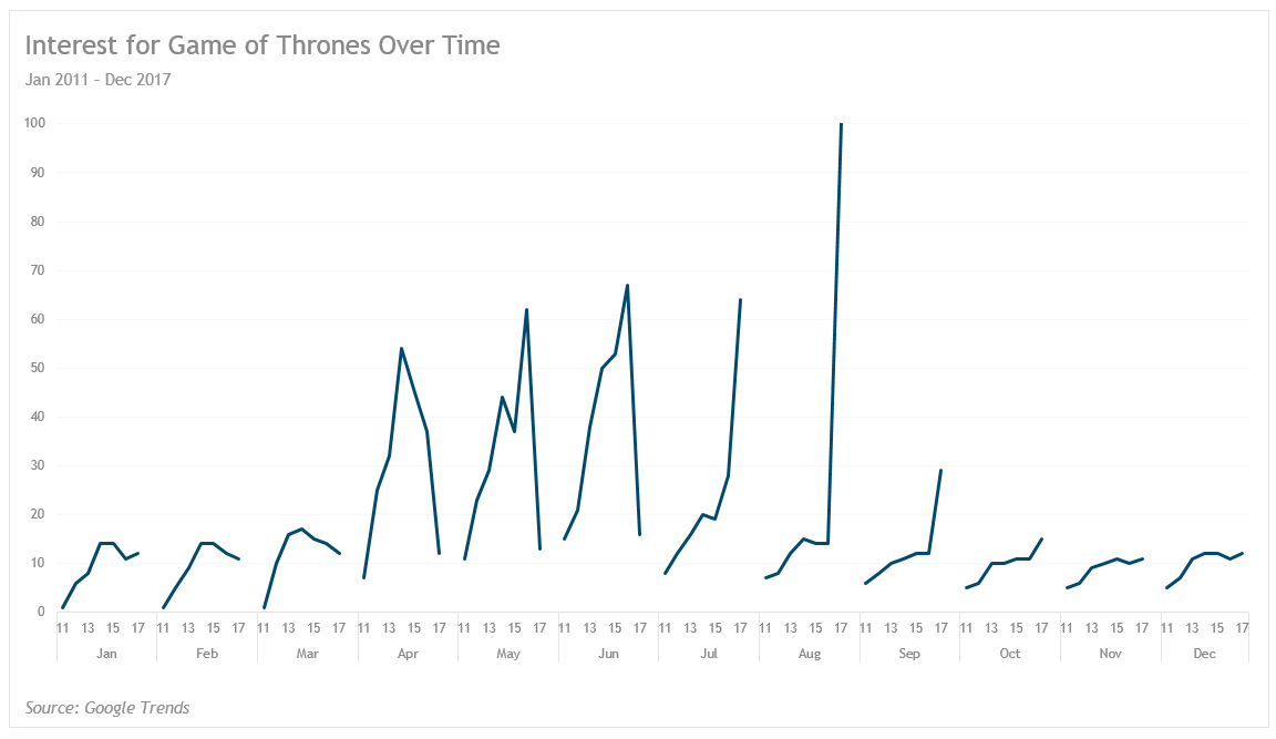
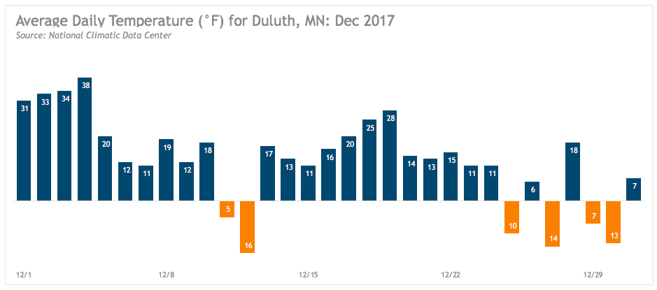
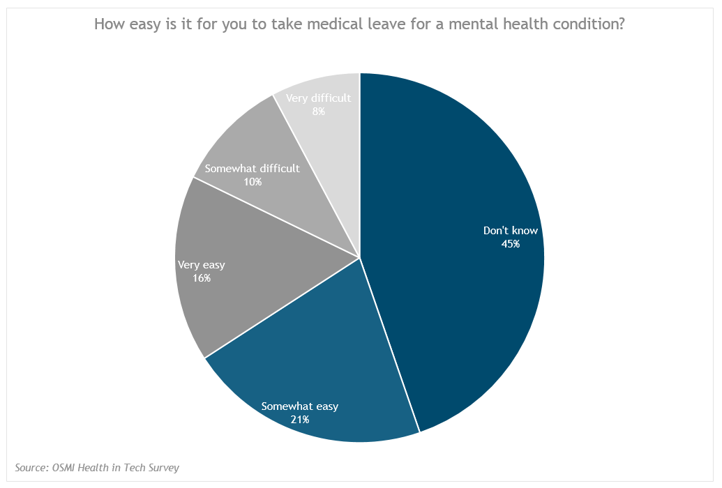
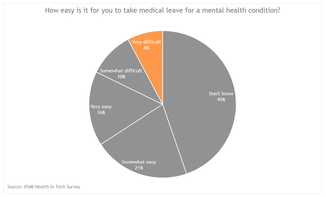
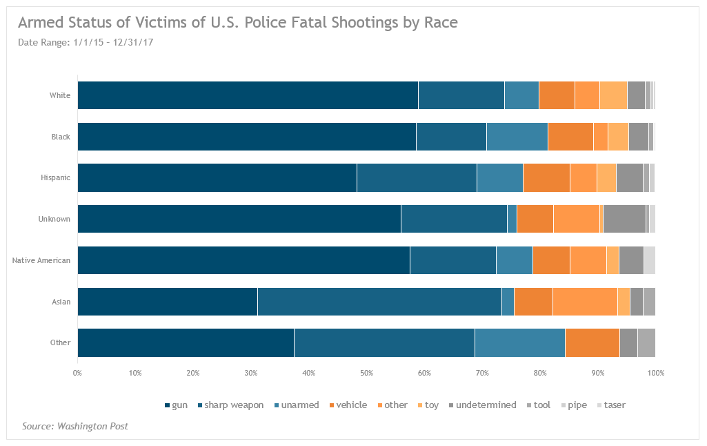
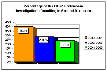
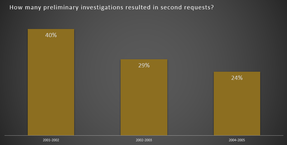
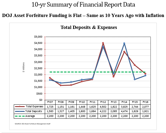
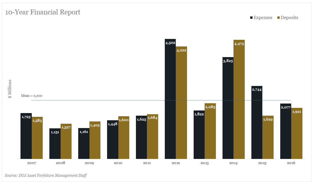
You’ll see how I use the U.S. Department of Justice as a cautionary tale to illustrate the importance of aligning visualizations with your brand. I even take a couple of the visualizations they’ve published on their site and offer some alternative visualizations, using their branded colors and fonts. I start with this bright-and-cheery chart (honk if you love 3-D charts!) and offering a couple alternative charts using the DOJ’s delicious colors.
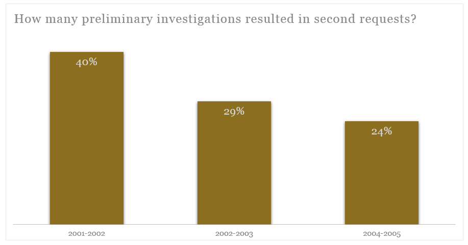
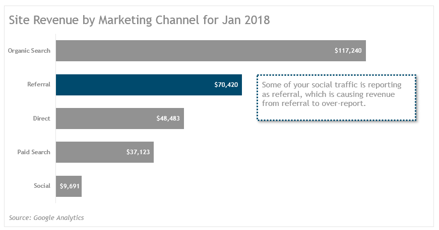
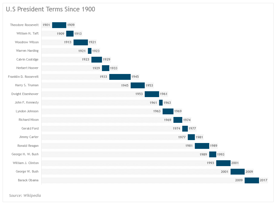
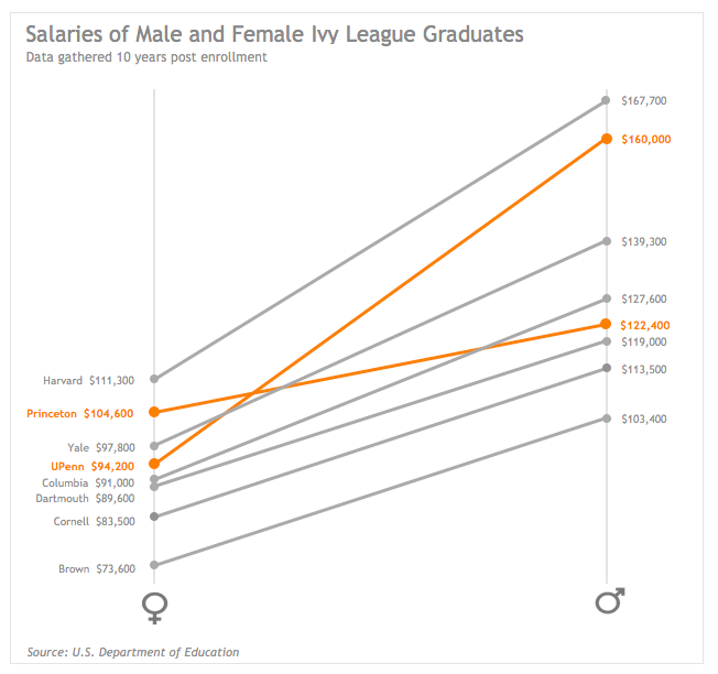
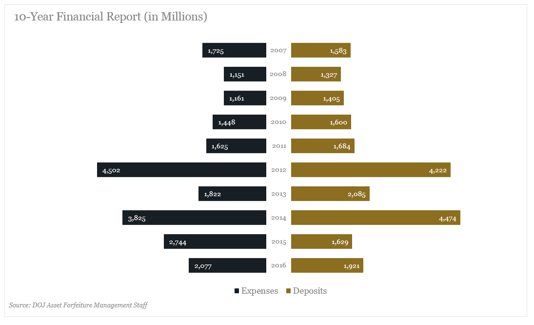
And then we get a little more amped up with some alternatives to this this other chart—that bore absolutely no similarity to the other hideous chart.
**You can pick your fonts in the PC version only…one of many missing features in the Mac version of Excel.
Alternative Purchases
Chart Templates
Although I highly recommend learning to create all the charts in the book, one shortcut to mastery is to purchase the template files and customize them to align with your branding. Not all charts can be saved as templates at this time (such as all the charts introduced in the 2016 version of Excel). And some are too hacktastic to be saved as chart templates. In those cases, I offer alternative solutions to creating your favorite charts from scratch each time.
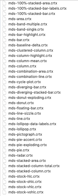
You can see a list of the charts that do have templates.
You can purchase this group of templates for $69.95 for Mac or PC, $99.95 for both.
Excel Files
If you want to see the pivot tables I created to organize the sample data, as well as the final visualizations, you can purchase the final Excel files for an additional $19.95.
Bundle
If you’d like to have both the chart templates and Excel files, you can purchase a bundle for $79.95 for either PC or Mac templates + Excel Files or 109.95 for both PC and Mac chart templates and the Excel files.