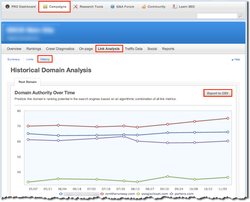
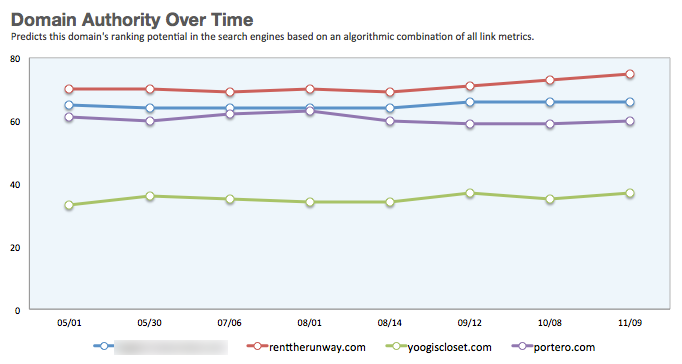
A reader made a special request via this comment for a tutorial that will replicate SEOmoz’s Historical Domain Analysis report. Although I try to keep my blog posts brief, I will go longer for special requests like this. 🙂 Without further adieu, let’s get going here …
Export Report
Step 1: After logging in to SEOmoz, click Campaigns in the top navigation bar. Step 2: Click site you want to analyze or click the View This Campaign button. Step 3: Click Link Analysis in the top navbar. Step 4: Click the History link. Step 5: Click the Export button.
Make It Sexy In Excel
Step 1: Open the csv file in Excel and save it as an xlsx file. Here’s what it will look like. (Eww)
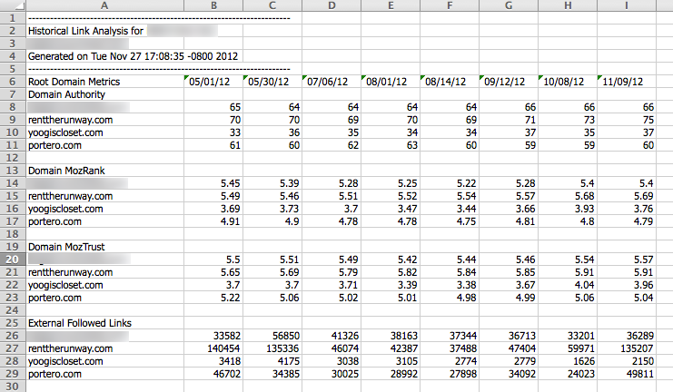
Note: Although the dates look like numbers, they were actually exported as text. You can tell because numerical values are right-aligned, whereas text is left-aligned. They’re also coughing up errors, as indicated by the green triangles in the upper-left corners of the cells. Step 2: We’re going to need to convert the dates to actual date formats. If you don’t care if the year shows up in the horizontal axis, as you can see in the screenshot in Step 5, you can skip this step. But if you want just the month and day, like you see from the SEOmoz chart, this step will be a necessary evil. To add an extra layer of complexity, the dates come in with a space in front, so that also has to be accounted for in the formula. In any case, the formula I used in B7 was =DATE(RIGHT(B6,2),MID(B6,2,2),MID(B6,5,2)). You can learn more about the DATE formula from this post.Then just drag the bottom-right corner of the cell to apply it to the cells to the right.

Note: I didn’t notice that the dates were formatted as text until I got to the end of this tutorial and tried to format the horizontal axis of the chart you’ll start to see in Step 5. But I’m not going back and redoing all of the screenshots. Just imagine the leading 0’s not there, okay? 🙂 Step 3: Click-and-drag over the data for the Domain Authority data set (sans the top, useless row). Finally, choose Insert > Charts > Line > Marked Line (Mac: Charts > Line > Marked Line). It will look ugly, but don’t lose heart. Also, you don’t have to replicate the SEOmoz chart exactly, but I will get it very close in this tutorial. Feel free to jump off the merry-go-round at any point though.

Step 4: For the love of all data that is holy, turn off gridlines: View > Show > Gridlines (Mac: Layout > View > Gridlines). They’re hideous and distracting. And evil. Then drag the bottom-right corner of your chart to give yourself some elbow room. Step 5: To format the lines, click on one and choose Ctrl-1 (Mac: Command-1) to pull up formatting options. (This works universally in Excel, and the formatting options change, depending on what you select. This is, hands down, my most frequently used shortcut in Excel.) Use these settings: Marker Fill: Set to white. Marker Style: Set to size 8 circle. Line: Set line weight to 3 pt. Rinse and repeat for each data series (Excelese for each line). Starting to notice a striking similarity?
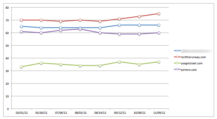
Step 6: Next, let’s move the legend to the bottom of the chart area. Select the legend, choose Ctrl-1 (Mac: Command-1), and choose Legend Options > Legend Options > Bottom (Mac: Placement > Bottom). While the legend is still selected, bump the font up to 12 pt to make it more readable. Step 7: Next, we’ll get rid of the chart gridlines. Just select any of the lines (except the top one). Then open the formatting options (you know how now), and set Line Color > No line (Mac: Line > Solid > Color: No Line).
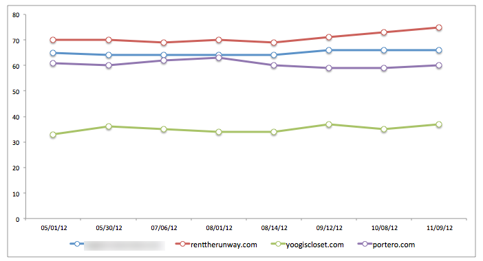
Step 8: Now let’s work on the chart area a bit. Click anywhere inside the white space (but be careful not to hit one of the data series). I’m not going to spoon-feed you at this point (mostly because I’m working off a Mac and looking up instructions for the PC). But if you’ve gotten this far, you can probably figure out how to find basic settings. I set the fill to a light blue with half the transparency and the line to a light gray. Step 9: Let’s get rid of the line around the outside. You know the drill. Set Line to No Line.
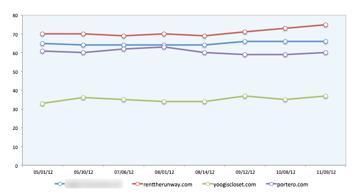
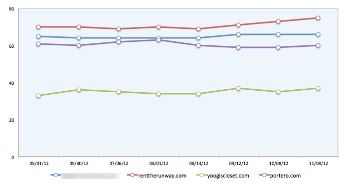
Step 10: Now let’s attack the vertical axis. The SEOmoz chart starts at 40 and has no 0 at the bottom. Under Axis Options (Mac: Scale), change the Major Unit to 40 and Major tick mark type to None. For the Mac, you need to choose Ticks to access major tick mark type.
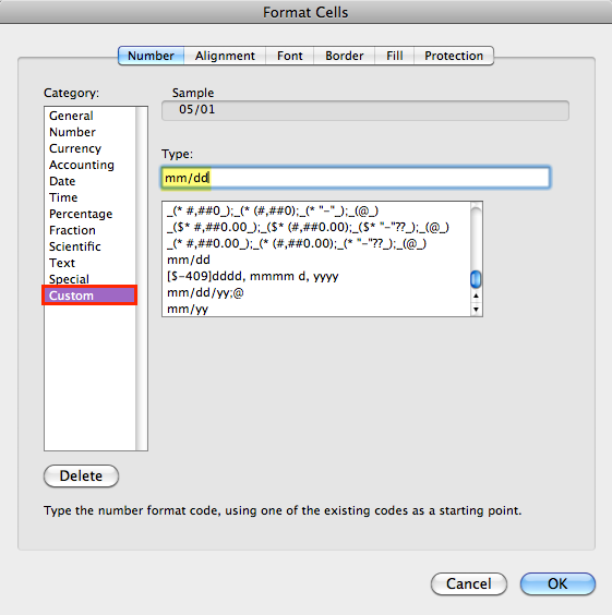
Step 11: Now let’s clean up the horizontal axis. First, select the dates in the table you built the chart from, and choose Ctrl/Command-1 to open the formatting options. Then, under the Custom option, set the format to mm/dd. (You can learn more about date formatting here.)
Step 12: Because the dates don’t follow a consistent interval, we’ll need to set the axis type to text. It’s a hack but the only way you’ll get the job done. With the horizontal axis still selected, choose Axis Options > Axis Type > Text axis (Mac: Scale > Horizontal axis type > Text). Then get rid of tick marks as you did in Step 10.
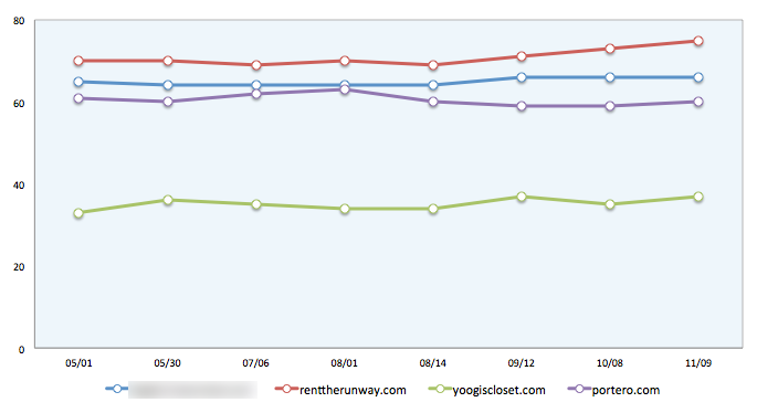
Step 13: As a final step, I added a chart title. To do this, select the chart and select Chart Tools > Layout > Chart Title > Above Chart (Mac: Chart > Chart Layout > Labels > Chart Title > Title Above Chart). I also moved the text box to the left of the chart and tinkered with the font.

Leave a Reply