One annoying idiosyncrasy of pivot tables is that all of the headings are prepended with a label indicating how the data is summarized. The most common one you’ll see is “Sum of” [original heading], although “Count of” is the default with non-numerical values. When you combine that with the wonky labeling the Google Analytics API serves up (all lower case and geektastic argot), your pivot table will look like a red-hot mess a la …
Transaction revenue? Really? We couldn’t just call it Revenue like normal people?
There is an easy way to remedy this, and there are the awkward processes you’ll read in the Excel help files and support site. Ima teach you the easy way!
Caveat
There’s one nuance you need to know first, which is you can’t use the same heading as is in the original data set. So if the original data set has a column with a heading of “visits” you can’t use Visits (even if it’s capped). What I used to do was change the original data set heading so that I could free it up to use in the pivot table. Lame.
The EASY Way To Fix Headings
The easiest way to change the headings is to just type over them with the new title, and if you want to use the same heading, just add a space to the end, like “Visits “.
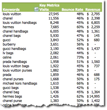
You can also change headings like “Row labels” and “Values” to headings that are more intuitive. Here’s what mine looks like after making some changes:
Ahh much better!


Leave a Reply