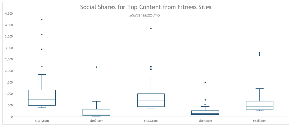
A few years ago I took some statistics and R courses, and I noticed a peculiar thing: Every one of the instructors across the different training platforms started their analyses with a box plot. They did it to get a lay of the land and quickly spot potential issues like skew, kurtosis, and pesky outliers….
Read the rest of the post and check out the video on the Making Data Sexy website.
Leave a Reply