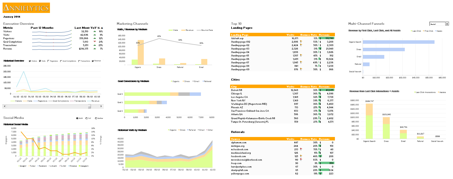
I hesitate including this video in a blog post because it’s primarily promotional and was created for my seminar landing page. But I decided to blog about it because, promotional intent aside, it gives a good overview of how you can use the Google Analytics API to pull together a reporting dashboard.
A Tale Of Two Dashboards
I demo two different dashboards, one built with Excellent Analytics, a free Excel add-in that pulls Google Analytics API data right into Excel, and the other with my favorite API tool, Analytics Canvas. If you want to dabble with the API, I wrote this blog post on the Search Engine Land site that explains, in simple steps, how to get started with the API. But you need to understand that this tool has been largely abandoned by Ampliofy, the company that generously created it. It hasn’t been updated in years, so it’s missing a lot of essential dimensions (such as channel groupings and metros) and doesn’t integrate with the absolutely essential Multi-Channel Funnels Reporting API.
The Chart Every Reporting Dashboard Should Include
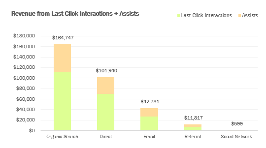
I demonstrate a chart that I created using the Analytics Canvas tool that every analytics dashboard should include, without exception. It’s at the 10:40 mark, if you want to skip ahead. And you can check out this post from my SearchLove presentation from last year to see why this chart should be included in every analytics dashboard that includes revenue data (whether from ecommerce or goal values).

Caveat
This dashboard is actually a bit busier than I would normally create. The reason for that is I tried to include all of the visualization techniques I think every marketer should learn how to create — and not just with analytics data. ALL data. There are also four interactive elements I wanted to hit on in the course, which are in the dashboard.
Templates For Attendees
That said, attendees will walk away with these dashboards to use as templates for their own sites. And I will be sharing a code that seminar attendees will be able to use to get 60 days of Analytics Canvas free. With that particular tool, attendees will be able to simply point the template I created to their profile, and the Excel dashboard will update with their data. So they could just use that template for their own reporting needs. But by the time they finish, they’ll feel comfortable enough to update it to align with their unique reporting needs.
Video
Without further adieu, here is the video walkthrough.
Sign Up
Again, to check out seminars being offered, check out the seminars page.
Learn More
To learn how to make your own detailed dashboards from the comfort of your own home, check out my Annielytics Dashboard Course.
Does the Excellent Analytics add-in work for Excel for Mac?
No, it doesnt’. You’d have to run parallels or vmware. They have a pro version for Mac, but I don’t like the Pro version for PC. You have to have put all the queries in one column, which makes no sense to me and makes organizing your data nearly impossible.
Corey, I know the geek speak can get a little ridiculous with analytics.
Whenever you see path in GA, think URI (the URL sans the subdomain,
which GA calls the hostname, btw). So path = URI and hostname =
subdomain, e.g.,
راهبند – درب اتوماتیک شیشه ای