Storytime
When estrogen was being rationed out at my conception, supplies were apparently low. The last time I was called “young man” I was in 9th grade. I lived in baseball hats and jerseys, wrestled boys on the playground, and won both the unofficial swing-jumping contest on the playground (you don’t want to know) and my hick town’s Centennial marble championship.
Needless to say, I’m not well versed in things of a more delicate nature like fashion shows. However, I somehow produced one of the girliest girls to ever walk the earth. And she’s a vintage hair stylist who on occasion styles hair for fashion shows. Which she just did last week. So fashion shows are on my radar right now.
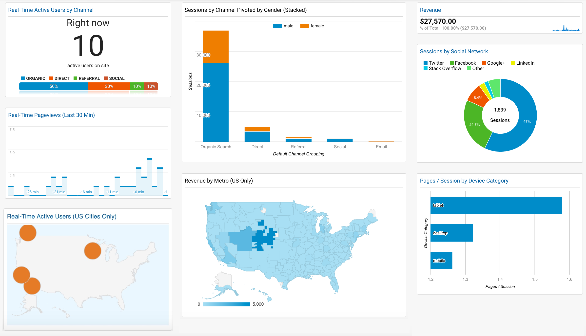
What does that have to do with dashboards in Google Analytics? Not much. Except to say that dashboard pictured above is not one that you necessarily want to apply to your Google Analytics account because it makes sense or follows a logical flow. No, it’s more of … well, a fashion show demonstrating a few of the sexier options you have when building out dashboards in Google Analytics.
So you may want to apply it to your account, but more to tool around to see how the widgets were built. I go through the options available to you in pretty fine detail in this very comprehensive guide. (Comprehensive is how I roll, as evidenced by the rest of my Resources section.) But sometimes it helps to pop open the hood and get down and dirty with the data on your own.
The Basics
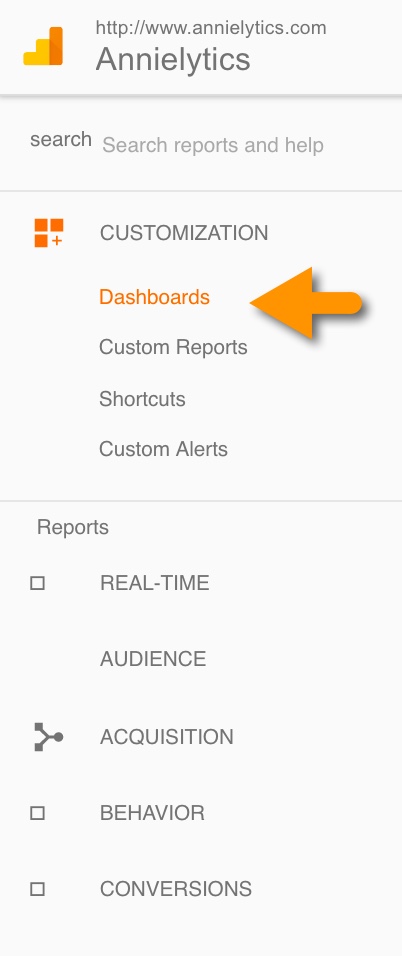
You can navigate to Google Analytics Dashboards section by selecting Customization from the left navigation bar and choosing Dashboards.
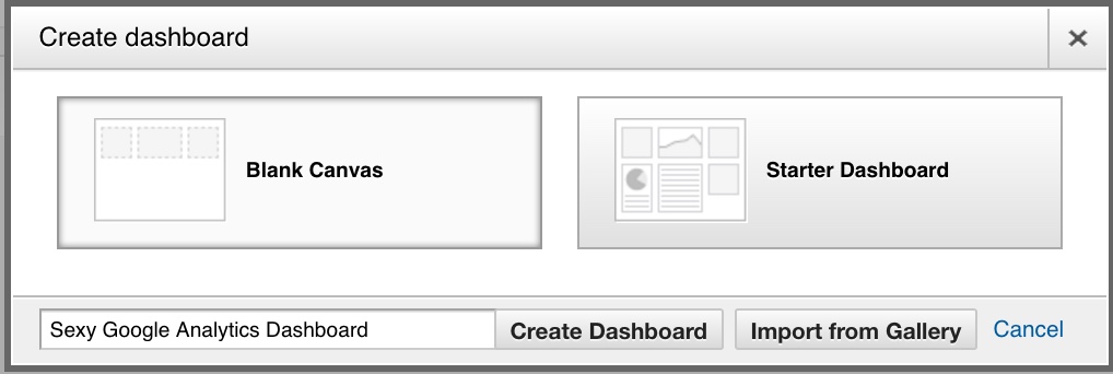
To get started, click the red Create button in the upper-left corner of the screen. You can access a number of dashboards from the Google Analytics Solutions Gallery by choosing the red pill (Import from Gallery), create your own using a template by choosing the blue pill (Starter Dashboard), or say no to drugs by choosing no pills (Starter Dashboards). You might be able to guess my preference.
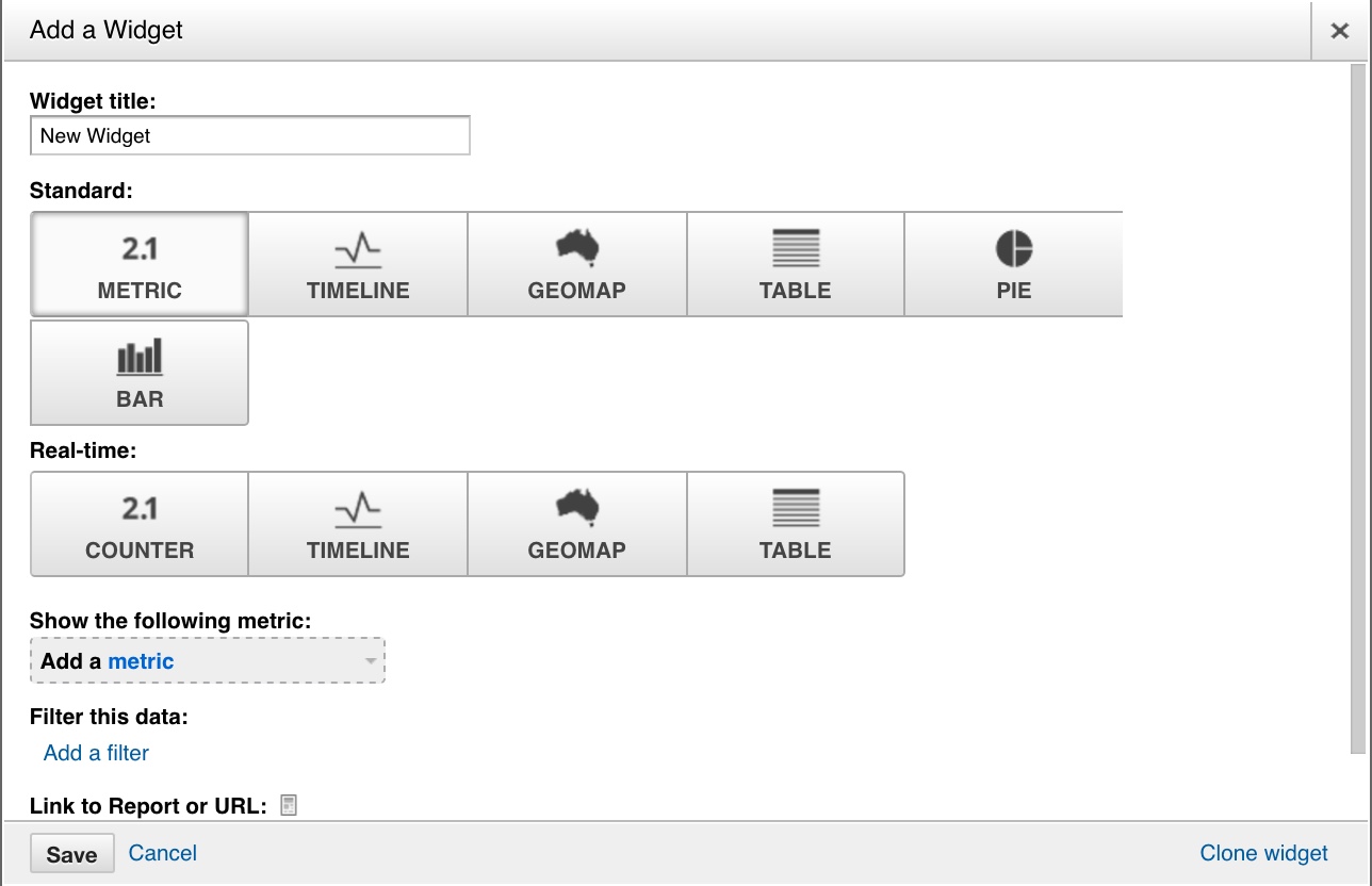
If you choose to create your own you’ll need to give it a name and select the Create Dashboard button. This will open the Add a Widget menu.
Give your widget a name and you’re ready to launch.
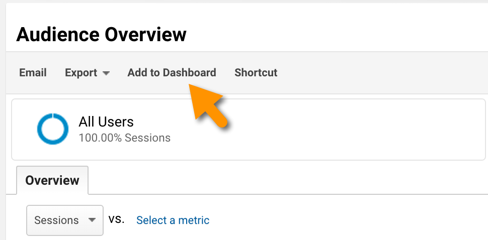
Alternatively, you can add any report you either navigate to or create in Google Analytics by using the Add to Dashboard button at the top of every report.
You get a total of 12 widgets per dashboard, so use them well.
<dj record scratch>
A Few Caveats
Not gonna lie. Google Analytics’ dashboards haven’t kept pace with the accelerated pace of innovation compared to the rest of the tool. Granted, we’ve been spoiled silly the past few years as innovation has spiked considerably. But, being a data vis junky, it has been disappointing at times to work with the pretty limited dashboard options, especially in comparison to other dashboarding tools on the market.
They’re outdated, clunky, formatted to align with Google’s brand instead of allowing users to choose their branded colors, buggy (as you’ll see later in the guide), and lack the AJAX options you’ve been spoiled by if you’ve used pretty much any other dashboard tool on the market.
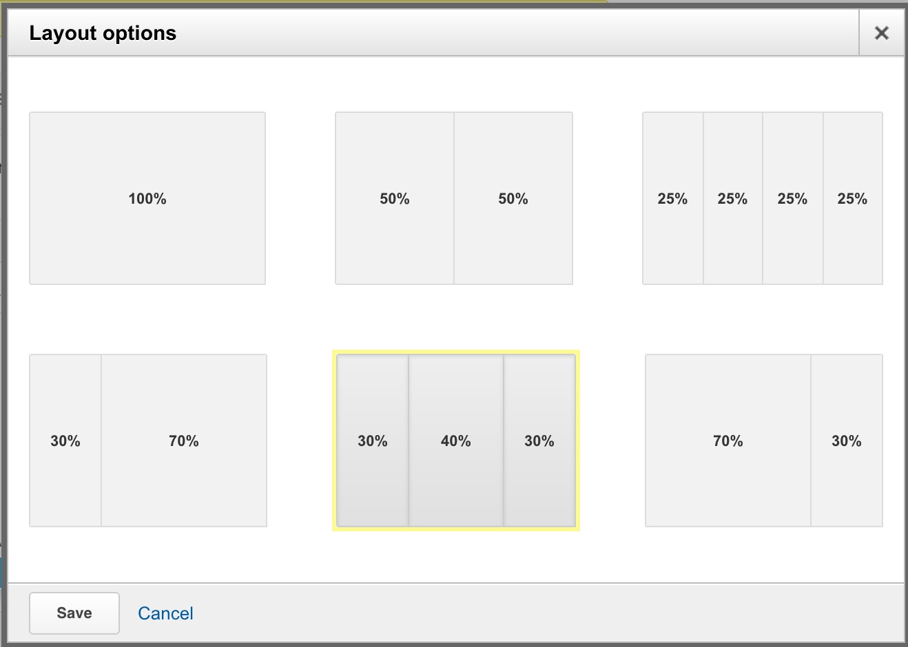
You can access these options by clicking the Customize Dashboard button in the upper-right corner.
They’re also missing all of the Multi-Channel Funnels metrics and dimensions, even though they’ve been around since 2011. That can make it challenging to get smaller clients excited about MCF reports because they’re not in front of them like all of the other Google Analytics reports.
But with dashboard tools that allow you to marry your analytics data with a plethora of other marketing, financial, and administrative data as inexpensively as you can with Cyfe (a fantastic tool for simple dashboards and dirt cheap) all the way up to a more enterprise tools like Looker or Tableau (my personal fave), you might wonder where Google Analytics dashboards fit into the ecosystem. But they serve their purpose and are still the mainstay for many small businesses and consulting shops. They can also be useful in providing marketers with a free and easy way to monitor their site’s performance.
Don’t Be a Noob
The biggest mistake I see with them is the total lack of sex appeal. I Googled google analytics dashboards, and here are a few of the dashboards that popped to the top of the search results. I mean no disrespect to the creators of the dashboards captured below. But I cringe every time I see a dashboard that looks like a solid wall of text and numbers, with an occasional pie chart thrown in for good measure. It’s kind of like throwing on lipstick and no other makeup, but hey, at least her lips pop!
Visualization Tips
There are few things in the data world quite as uninspiring as a dashboard full of tables. So I’m going to share a few tips I’ve discovered to add a bit more sizzle to your dashboards.
Don’t Just Use Tables
Seriously. Tables suck. They’re very difficult to see trends. Your eyes have nowhere to rest as everything just feels like it’s screaming at you.
And you actually have quite a few alternatives to bourgeois tables at your disposal in Google Analytics:
- Column charts
- Stacked column charts
- Clustered column charts
- Bar charts
- Stacked bar charts
- Clustered bar charts
- Maps
- Heatmaps
- Line charts
- Pie charts
- Donut charts
- Microcharts (e.g., sparklines)
So hopefully by the end of this post you will be able to just say no to tables (at least to using tables exclusively) and build dashboards that offer more eye candy, like the cornucopia of chart types I offer in the dashboard you can apply to your account at the end of this post.
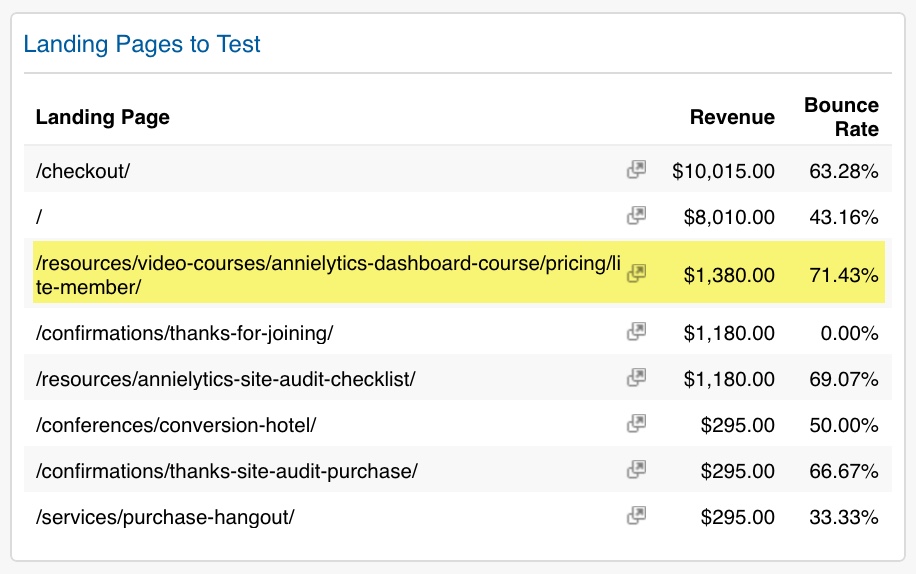
If you are going to use tables, I recommend getting the most bang for your buck by pitting two metrics against each other, like revenue and bounce rate for landing pages to identify landing pages that drive revenue but could be improved by some A/B testing, as evidenced by high bounce rates.
Use Bar Charts Effectively
Create Pivot Charts
Did you know you can include pivot charts in Google Analytics dashboards? Do you know how many times I’ve seen pivot charts in a Google Analytics dashboard (besides mine)? I don’t recall ever seeing one. That doesn’t mean no one has ever used them. They’re just kind of like Rhode Island license plates. You remember when you see one.
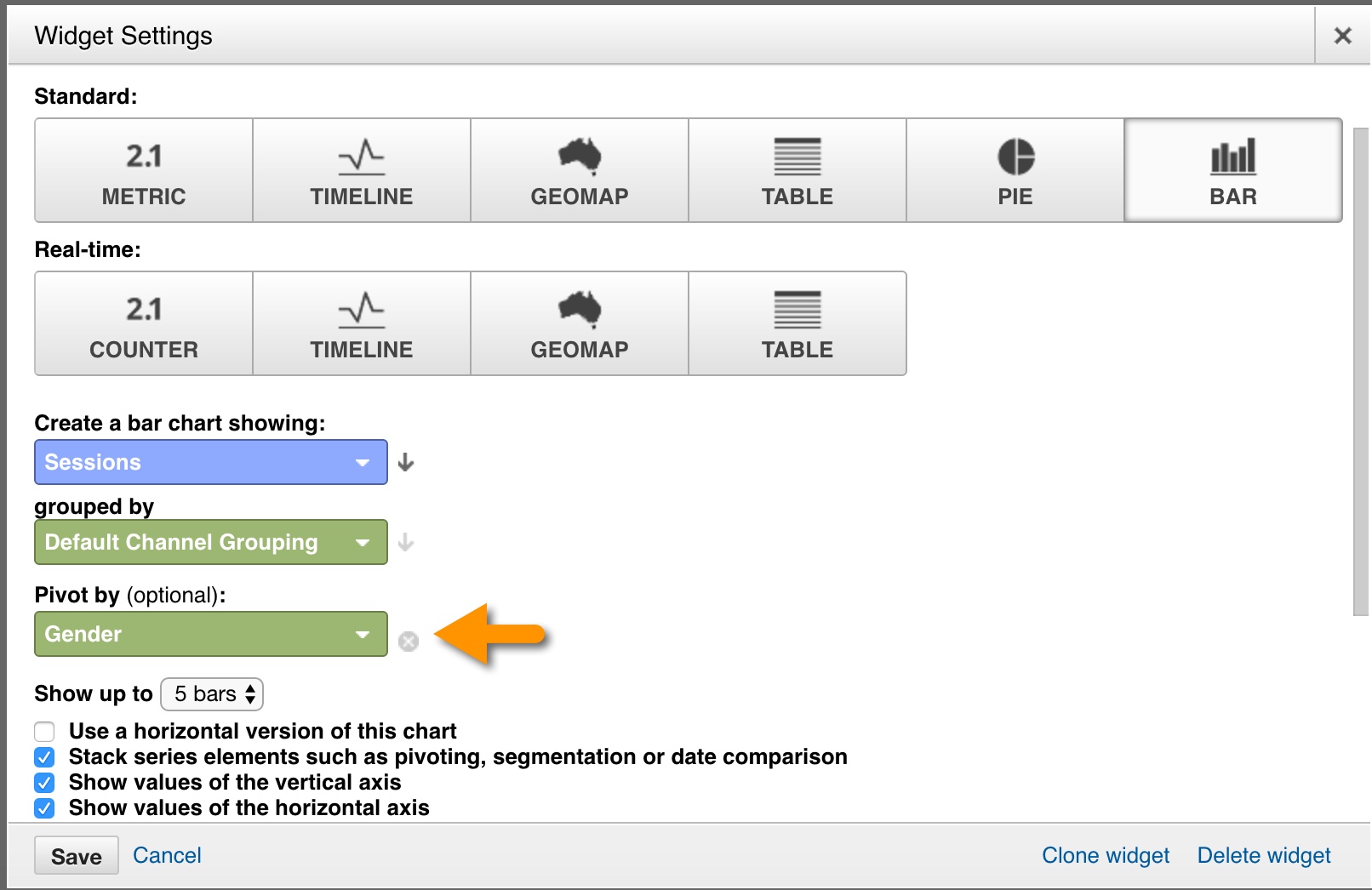
Anyway, here’s what you want to look for when you choose a bar chart.
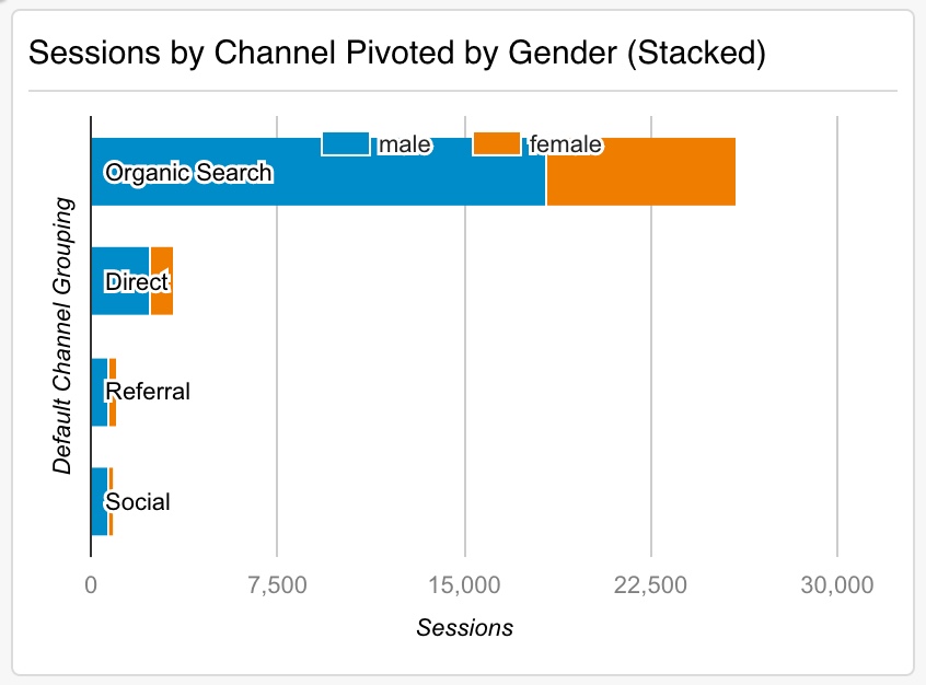
And here’s what they look like. The top one is stacked, and the bottom one is clustered.
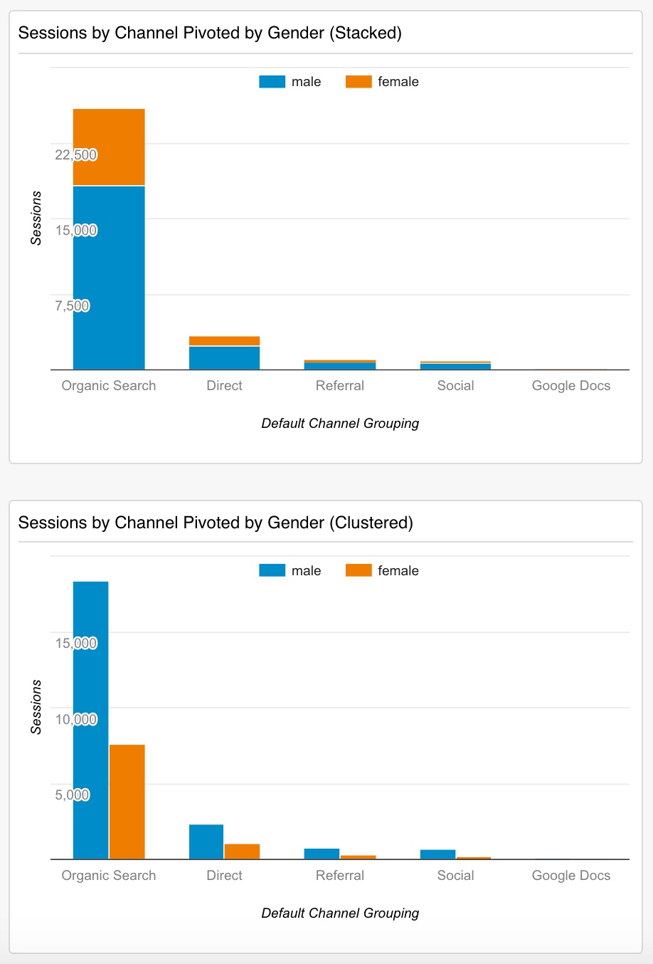
You can stack them by choosing the second checkbox from the top in the screenshot above.
Use Bars for Longer Labels
If you want use a chart but have longer labels, go with a horizontal bar chart. Google Analytics calls any chart with a bar a bar chart, whereas Excel and other tools differentiate between column and bar charts. In these dashboards, if you want a bar chart, just select the Use a horizontal version of this chart option (first in the stack in the screenshot above). In my opinion, column charts tend to be a little easier to see (and prettier), but bars can be quite effective.
Tip: If you include more than three bars in your chart (you can choose between 2 and 9 from the Show up to drop-down), the widget title gets overlaid on top of your top bar, which I would imagine is a bug. But it’s kind of like that friend from college who always got too close when s/he was drunk.
Use Single-Metric Widgets
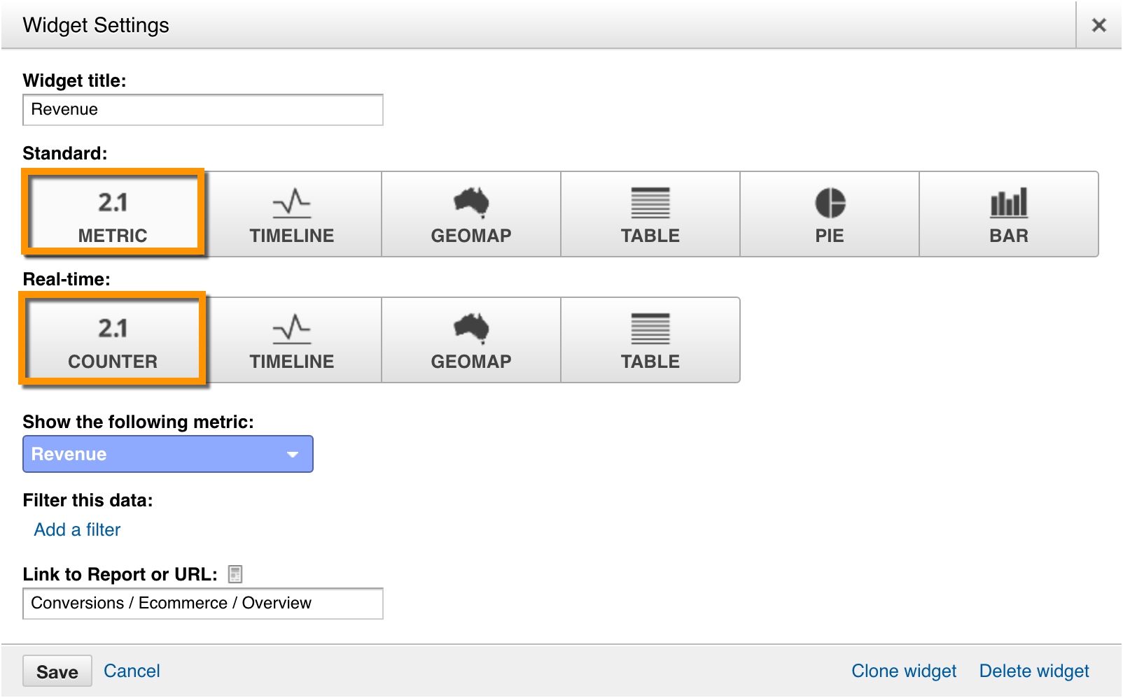
One thing I like to do with dashboards is have a column of just single metrics. You can select the Metric option for Standard widgets and Counter for Real-Time widgets.
The nice thing about this option is you also get a sparkline with the Standard metric. And with the Real-Time counter widget you can add segmentation. So you can see your real-time visitors broken down by Device Category, for example (i.e., desktop, tablet, or mobile) — or Default Channel Grouping (e.g., Organic, Referral, Social, etc.).
Rock Map Widgets
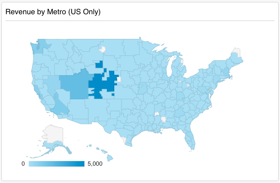
If you only imagine a map of the world, like you see in the Locations report (Audience > Geo > Location), you’re missing out. Below you can see a heatmap of just the United States that breaks down revenue to my site by Metro. (Btw, the Metro dimension is way more awesome than the City dimension.) There are more than 100 cities included in the Los Angeles metro area, for example. If you only look at the city of Los Angeles, you could likely miss out on really important data.
Hone in on Just the Data You Need
Via Filters
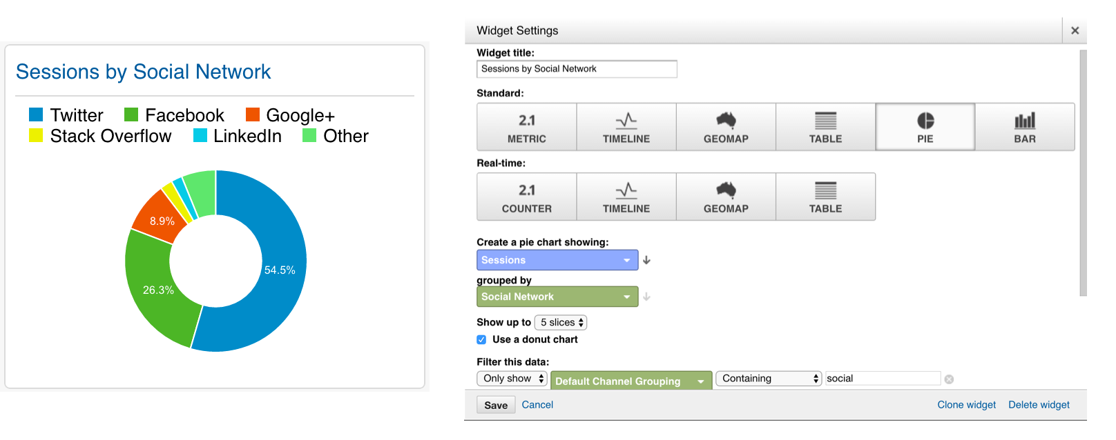
Google Analytics dashboards allow you to filter within a widget to get just what you need. For example, in the widget that shows a breakdown of social networks, I included a filter that only included traffic from the Social Media channel. Otherwise, the largest segment of the donut chart would have been (not set) since there obviously aren’t social networks associated with non-social traffic.
Filters can only be applied to an individual widget. If you want to filter the entire dashboard you need to use an advanced segment.
Via Segments
It’s outside the scope of this guide to explain how to use segments. You can learn more about them in this Kissmetrics post. The screenshots are a little outdated, but the principles are the same. The main point is when you apply a segment in Google Analytics or specifically to a dashboard, anything you look at will be filtered to only show that segment of traffic — e.g., iOS visitors, sessions from the Facebook social network (don’t use facebook.com), or even Facebook sessions from iOS devices.
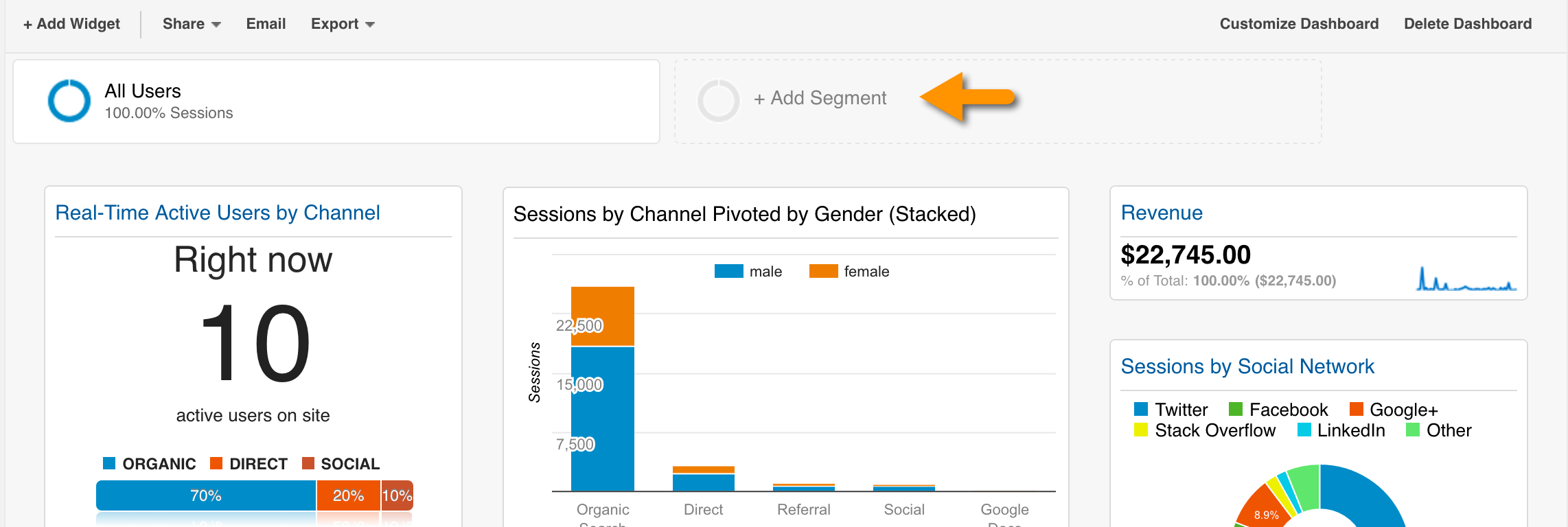
You can add a segment above the dashboard by clicking the + Add Segment button.
One thing to keep in mind with segments though is that they trigger sampling, so you need to stay under 500,000 sessions if you have any custom reports in your dashboard.
If You Have to Use a Pie Chart …
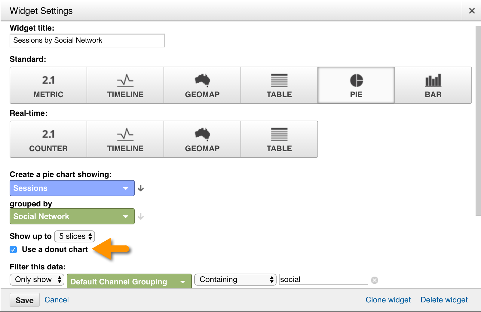
At least funk it up a bit by punching a hole out of the middle. A donut chart is at least a little cooler than a pie chart.
Link to Reports
You have the option to link to a corresponding Google Analytics report in each of your widgets. Linking a widget to a report will add a hyperlink the title. The widget on the left is linked, and the one on the right is not. Think introvert. It just wants to be alone and doesn’t play well with other data. (J/k, introverts!)
When adding a link you have a couple of options:
Link to Report
The benefit to linking to a report is you can share your dashboard with anyone. Even across accounts. In a very rough sense, it’s similar to the difference between hardcoding all the formatting of your site in your HTML or using CSS, the report option being parallel to the CSS option.
But the structure of linking to a report takes some getting used to. You just follow the cascading structure of Google Analytics reports, and Google will autosuggest reports to aide you.
For example, let’s say you want to link to my favorite child, the Channels report. You would type Acquisition / All Traffic / Channels.
Here’s what it looks like out in the wild:
URL
If you’re using a custom report, or you can’t link to the report (because you use a different metric or have to change the primary dimension), you can hardcode a link to the report. One disadvantage to this approach is your links won’t work when you share the dashboard with another Google Analytics account.
Also, even if you’re sharing your dashboard with others in your organization, you must first share the custom report with them (unless you use the same login … tsk tsk) before they can click through to your custom report. I wish Google consolidated this process and just prompted the user to accept the custom report before granting access. But I’m picky because I know that if I send a client six different links to various custom reports to accept and apply to their account before opening the link to the dashboard I built them, there’s a higher chance the client will forgo the custom report links and click through to the dashboard just to complain later that they can’t see the reports. (Based on a true story.)
Sharing Dashboards
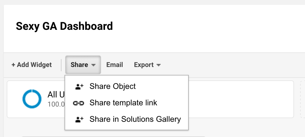
When you create a dashboard you have several sharing options.
- Share object: Use this option with people who have access to the same view. It shares data as well as the structure of the dashboard. It will show as Shared in your list of dashboards.
- Share template link: Use this option with people to use in their own Google Analytics accounts. It shares only the structure of the dashboard. It will still show up as Private in your list of dashboards.
- Share in Solutions Gallery: Use this to share with the world.
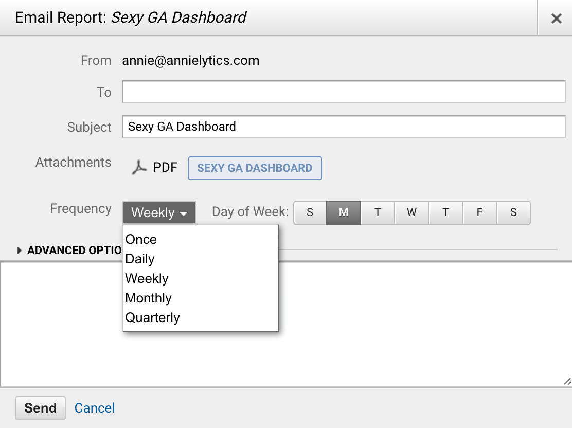
- Share PDF via email: Use this to share a snapshot of your dashboard to people who might not have access to your account. Simply click the Email button at the top of your dashboard. You will have all the options available when you email a report.
Get Link to Dashboard
To apply this dashboard to your Google Analytics account, click here and follow the prompts.
Final Thoughts
Eventually your lust for data will lead you to move to a third-party tool that uses APIs to pull all of the data most important to you into one dashboard. Google Analytics will never be that tool. But if your data needs are satisfied with Google Analytics dashboards for now, at least do yourself a favor and sexy them up using some of these techniques.
