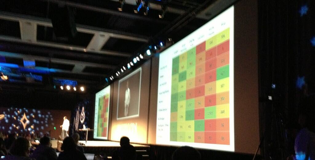
In Avinash Kaushik’s presentation at MozCon, he showed a really cool heat map that showed number of goal completions (for the most part) segmented by source/medium. It was an impressive display of sexy data, which caught my attention, as you might imagine.
So I promised that I would write a follow-up post on how to create one of these works of art.
Download Excel File
If you want to peek under the hood and check out the heat map I created in the tutorial feel free to download the one I worked from.
Breakdown Of Avinash’s Heat Map
Although I’m not usually wild about mixing mediums and sources in one report as his did, I’ll demonstrate how to get what he got. From what I could make of the photos provided by the awesome Thomas Ballantyne (who also took amazing photos of me speaking at said conference!), he included a handful of categories:
- Email Marketing
- Display Ads
- YouTube
- Social Media
- Bing
And also some goal metrics:
- Email Signups
- Orders
- Join Site
- Reviews
- Affiliate Signups
There were a few other goal metrics I couldn’t make out (and one I redacted because it would be too confusing to explain and didn’t come from analytics). But this should get us started.
Getting The Data From Google Analytics
To pull this report you’ll need to use a custom report. If you don’t know how to create one, I did a quick video tutorial. They’re awesome, and I use them all the time. However, they are more prone to sampling, whereas the standard reports don’t get sampled at all. So if I can use a standard report with no advanced segments to avoid sampling I do. But in this case you can only get actual conversion numbers in a custom report. The standard reports only provide goal conversion rate numbers.
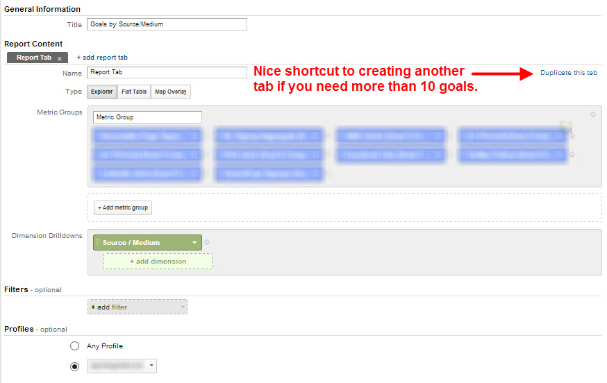
Here’s a link to a custom report with the first 10 goal slots filled out, and the medium is set to Source / Medium. If you want to report on more than 10 goals, click the Duplicate this tab link to the right and switch out the goals.

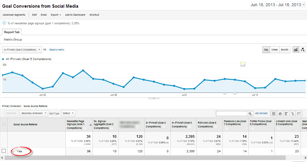
If you want the goal conversions for traffic from social media, as Avinash’s did, you’ll need to run a separate report. You can use this one I created, which looks like this:

The Yes just means yes, it came from a social source (e.g., Twitter, Facebook, YouTube, etc.). I unearthed a total of 248 social networks. A Google Analytics engineer confirmed this list was very close to theirs, not that he shared theirs. Pfft.
I chose Social Source Referral as the dimension and created a filter to show only those visits where that was true (hence the yes) so that you would only have one dimension in the report. Otherwise, you’d have to add up the number of goal conversions for each goal item. For example, if I used source as the dimension, you’d have to add up all the Goal 1 completions for Twitter, Facebook,, YouTube, Reddit, etc. What a pain.
No need to thank me. Or send me shoes.
Pro Tip: You’ll need to open both of these custom report links in the browser you’re logged in to your Google Analytics account with — or at least logged in to that Google account somehow, whether it’s in Gmail, YouTube, AdWords, or whatever. Otherwise, you’ll get a 404 error and join the list of people who have told me on Twitter that my link is broken.
If you need to choose different goal completions, just click one of the blue metrics boxes and start typing “goal 11 completions” — or whatever number you need. Alternatively, if you know the name of the goal you could type that in too. Either will work. (I like options.)
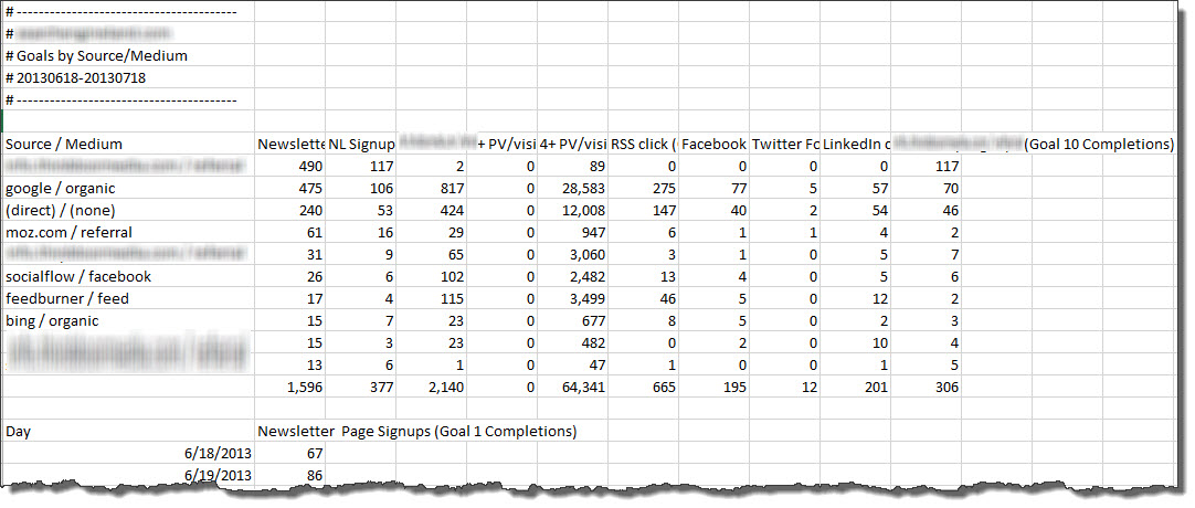
Your exports will look like this for the Source / Medium report:

And this for the social report, with one line item:

So you would just want to change that “Yes” to Social Media and add it to your other report.
Now I’m going to replace those real reports with sources and mediums that mimic Avinash’s report, as well as the metrics he used. This is how analysts cook the books.
Heat Map Tutorial (Finally!)
Okay, so I took the data, fabricated all of it, and deleted the heading for our first column of data (for aesthetics). The video takes you the rest of the way. It’s really short — only four minutes.
Awesome Annie – I love it! Thank you for taking the time to put this together.
You’re very welcome!
Annie, killer stuff. I’ve done similar things in the past. One issue I ran into is when I wanted to apply this heat map on a row by row basis (this just applies to whole data set). After some digging I found an Excel forum where someone had kindly written a macro.
I used it to present historical keyword volumes to a client to show trending and seasonality. Made for an awesome visual. I can share the link if you’d like.
I’d love to see the resource, but this modification would be really easy to make. I’ll do a follow-up video showing how to apply the conditional formatting on a row-by-row basis.
I’d love to see it. I had to apply it row by row which got pretty tiresome after more than 10+ rows.
Here is the link: http://www.excelforum.com/excel-general/721065-conditional-formatting-colour-scales.html?p=2268459&viewfull=1#post2268459
Sadly, I think you have to register to view the actual macro.
Sadly, Excel won’t let you use a formula with color scales. So I had to apply the formatting to one row, then use the Format Painter to apply it row by row. I found a macro in this post that will apply it to a data set with one click (http://bit.ly/15S2UrD), but it’s just a two-scale color scale. But if you know VBA (or know someone who does) you could easily change that. However, if you did it once, you should be able to just paste in new data and have it update.
The forum post I linked to has the necessary VBA to apply the heatmap that is similar to your post. You can just go into the VBA and edit the range and colors if you’d like and flip some of the code around to get ascending or descending. I just know I had to register to be able to view it.
Just sent you the actual code via your Contact Form, FYI.
Cool! I’ll check it out. Thanks!
That is brilliant. Love your attention to detail down to white lines between the cells!
Thanks! I noticed the white borders at the last second, just before recording the video. They did add a nice touch of panache. 🙂
Hi Annie, I put your post in the Google Partners Forum. This was Awesome. I wonder if there is a way to incorporate a third dimension like (Revenue or Bounces) – Overlayed (Vertical – Thermo style) – So you could quickly spot opportunities.
Thanks for doing that! I’m glad you liked the post. This would be, at minimum, a lot easier if you were able to use formulas for all conditional formatting. (Unfortunately, you can’t.) Then you could, for example, add icons to indicate bounce rate levels on top of the color scales and have these icons reference data points (e.g., bounce rate) that aren’t in the individual cells. IOW, put a red light in this cell if the bounce rate referenced in the cell to the right is higher than 70%. That would be pretty slick. But, alas, you can’t.
However, bubble charts do allow you to add a third dimension of data, where you could have the bubble location in the grid reference one data point (e.g., conversions) and the bubble size reference another (e.g., bounce rate, conversion rate, revenue, etc.).
Conditional Formating formula’s what a great idea!- Someone would should yell at Excel to make this a feature request. Almost sounds like setting up custom automated rules (for Excel 🙂 ) – to flag if certain criteria/events occurs (Sheet wide) as you make changes… , that would be useful, across just about every complex document, instead of building formula’s line by line…
You can use formulas for conditional formatting; you just can’t use them with icons, which blows. You can just do cell and font formatting. That wouldn’t work too well with the heat map. The most you could do is maybe change the text color for a third metric, but then that would get difficult to interpret.
This is so useful! Thank you!
You’re welcome!
Nice One Annie, cheers, this will be handy, plus i didn’t know about that conditional formating which makes life easier
Oh yeah. Conditional formatting is awesome. You might enjoy this post I wrote on Search Engine Land: http://searchengineland.com/how-to-go-picasso-on-your-data-with-conditional-formatting-132627
Hey that link is even better , thanks Annie. Gee, I feel like its Learning Friday again!
Those are the best kind! 🙂
Hi Annie thanks for sharing! Can’t wait to use it! This is definitely awesome stuff!
You’re very welcome!
This is awesome stuff! I especially liked the goal conversion for source/referral report. Never thought of that way. I guess that is why I am no Avinash Kaushik 🙂
You and me both! But I was tutored by him. That’s as close as I get. 🙂
Hi Annie, the link for downloading the excel file is not working, please fix it
It’s fixed.
Thanks.. Love the name of your website, annielytics..
Thanks.
Annie for President!!
We’d all be in trouble. 🙂
Dear Anni,
Thanks for the wonderful video. It helped me a lot. I would like to add one more point. If any one want a proper “HEAT PLOT”with no values visible, just select the data right click to reach to the format cell menu in the in costume category type three semi colon “;;;”. click ok done.
Best,
Kapil
Thanks, Kapil.